1 May, 2024 | Admin | No Comments
Pixelated furniture appears throughout Lunet eyewear store in Bucharest

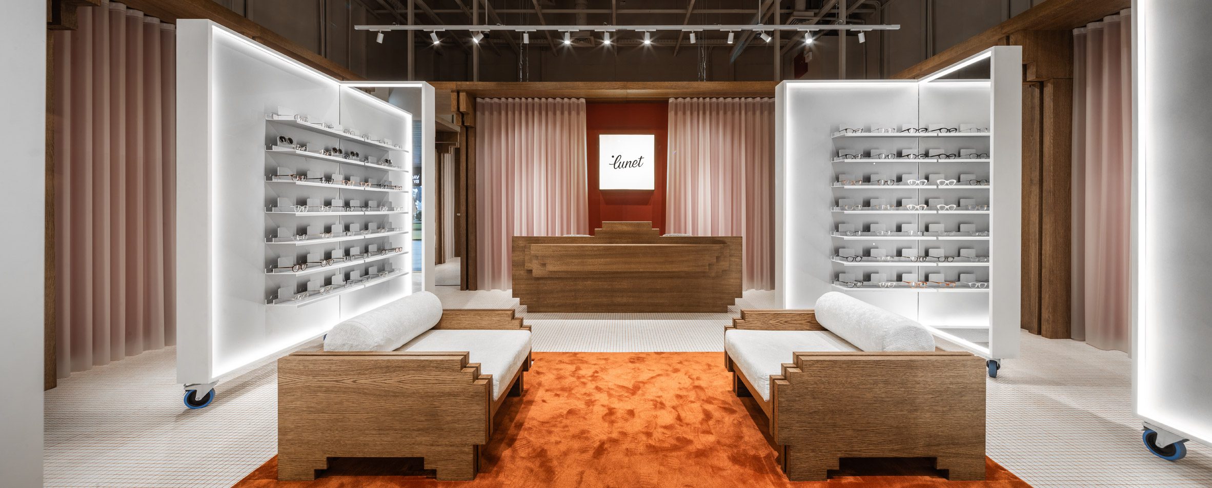
Romanian practice Bogdan Ciocodeica Studio played with the idea of “blurry vision” in this eyewear store in Bucharest, where pixelated furnishings sit against translucent latex curtains.
This is the third space that Bogdan Ciocodeica Studio has designed for Lunet, having worked on the eyewear brand’s inaugural Bucharest store and another branch in the city of Cluj-Napoca.
The interiors of the two other locations play with colour and metallics, but the firm wanted this store to look like “a playful and pixelated environment”.
“All the shapes and volumes are stylised and synthesised to their essence, stripped of unnecessary information so that they become almost low-resolution images, containing only the vital information,” Bogdan Ciocodeica Studio explained.
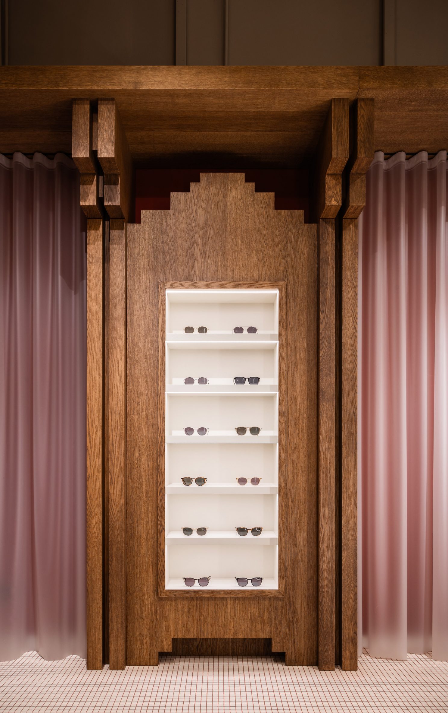
Glasses are displayed on tall wooden shelving units that were installed at intervals around the store’s periphery, with square cutouts designed to mimic the blocky form of pixels.
Translucent latex curtains were hung between the shelves. “[They] give depth and texture to the otherwise straight walls, granting it almost a blurry vision-like effect,” added the studio.
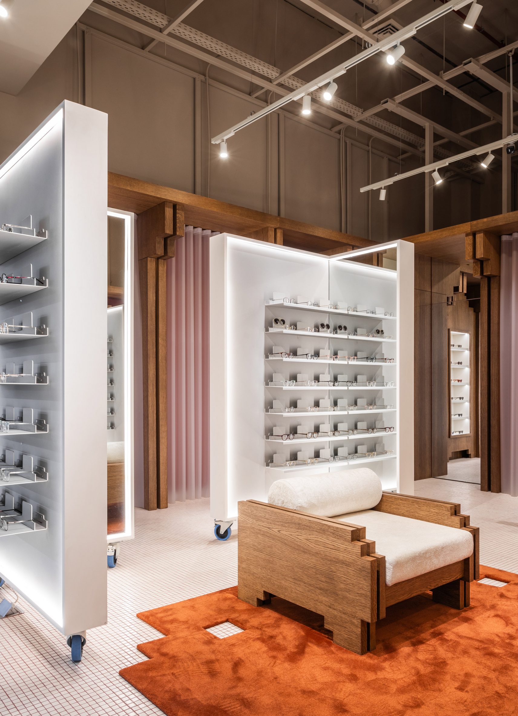
More glasses are showcased on freestanding L-shaped partitions, each incorporating a full-length mirror and set on wheels so they can be easily moved around.
A seating area at the heart of the store is furnished with two wide-set wooden chairs, their armrests featuring the same pixelated edging as the shelves.
Underneath the chairs is a large burnt-orange rug with pixel-shaped openings that offer fun peeks at the store’s gridded tile flooring.
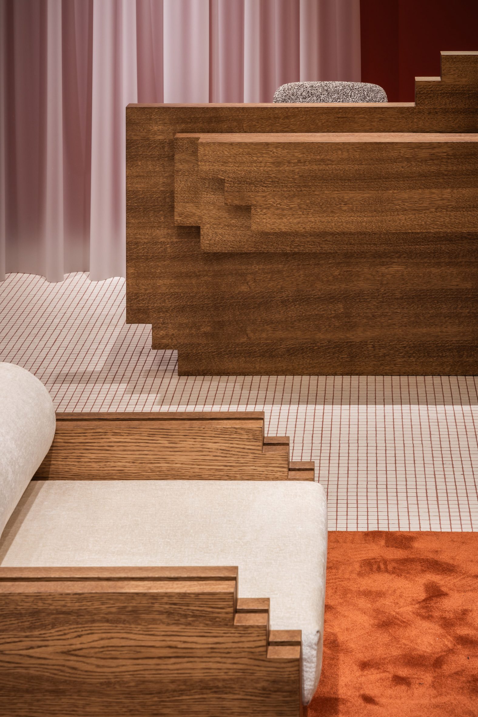
Pixel-style cutouts were also made in the wooden service desk, which sits directly beneath a lightbox displaying Lunet’s logo.
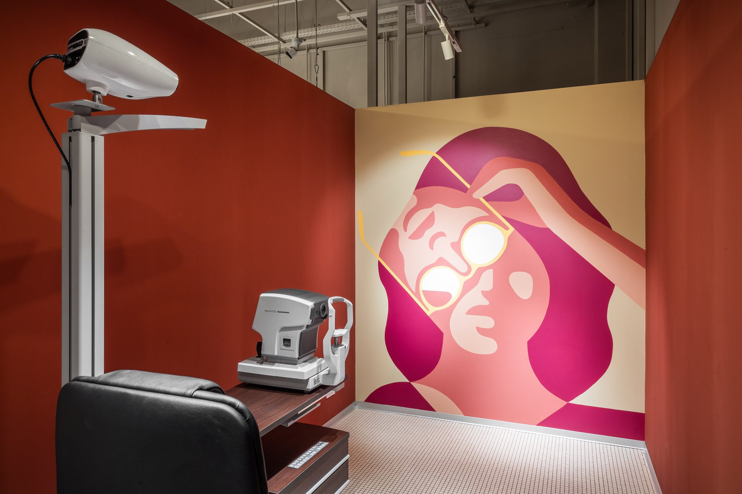
Eye tests are carried out in a secondary room towards the rear of the store. All the walls here were painted brick-red except one, which features a brightly-hued surrealist graphic of a woman wearing sunglasses.
A number of other architects and designers have incorporated pixels into their projects. Canadian studio Partisans used pale yellow bricks to create an undulating pixelated facade for a home in Toronto.
And ODA also staggered apartment blocks to form a pixelated residential block in New York.
The photography is by Vlad Patru.
The post Pixelated furniture appears throughout Lunet eyewear store in Bucharest appeared first on Dezeen.

Dezeen Events Guide has launched its guide to NYCxDesign 2024, highlighting the key events in New York City from 16 to 23 May.
The festival celebrates its 12th anniversary with a programme of exhibitions, open showrooms, tours, talks, design fairs and product launches.
Located across neighbourhoods in Manhattan, Brooklyn and Queens, around 200 events are taking place across eight days, spanning architecture, design, art, fashion and technology.
Use our interactive map
This year’s guide also features a curated map with the key events of the festival, helping you navigate your way around the city.

There is still the opportunity to feature in the guide
There are three types of listings still available:
Standard listings cost £125 ($160) and include the event name, date and location details plus a website link. These listings will feature up to 50 words of text about the event.
Enhanced listings cost £175 ($225) and include all of the above, plus an image at the top of the listing’s page and a preview image on the Dezeen Events Guide homepage. These listings will also feature up to 100 words of text about the event.
Featured listings cost £350 ($450) and include the elements of an enhanced listing plus a post on Dezeen’s Threads channel, inclusion in the featured events carousel on the right hand of the homepage for up to two weeks and 150 words of text about the event. This text can include commercial information such as ticket prices and offers and can feature additional links to website pages such as ticket sales and newsletter signups.
For more details about partnering with us to help amplify your event, contact the team at eventsguide@dezeen.com.
About Dezeen Events Guide
Dezeen Events Guide is our guide to the best architecture and design events taking place across the world each year.
The guide is updated weekly and includes events, conferences, trade fairs, major exhibitions and design weeks.
The illustration is by Justyna Green.
The post Dezeen Events Guide launches digital guide to NYCxDesign 2024 appeared first on Dezeen.
1 May, 2024 | Admin | No Comments
Holloway Li furnishes Mother London office with bold-coloured furniture

Interior design studio Holloway Li has reimagined the office of advertising agency Mother London using bespoke furniture that nods to the 1970s to enhance its industrial setting in Shoreditch, London.
Aiming to create a flexible multi-purpose space, Holloway Li reconfigured the ground floor and mezzanine of the office – located in a former tea factory – to host an open-plan kitchen, dining area and seating space, along with an updated reception area.
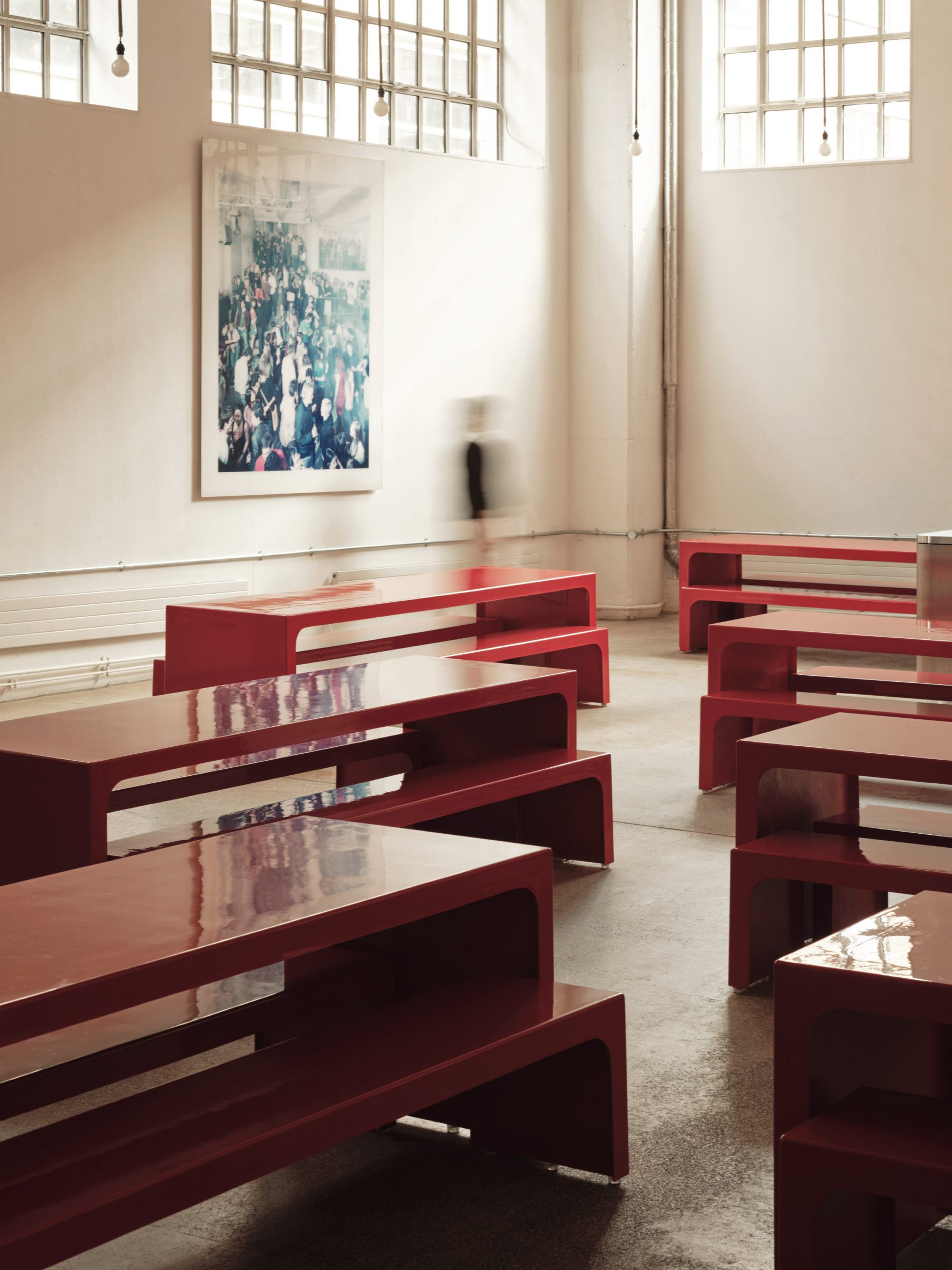
Bright red tables line the dining area to provide a flexible space for hosting office lunches as well as meetings, events and exhibitions.
Designed by Holloway Li and manufactured by collaborator UMA, these bespoke tables nod to 1970s furniture design and feature a structural foam core encased by a thin layer of fibreglass, chosen for its lightweight materiality.
“Whilst celebrating the brand’s distinct and eclectic character, we wanted to reinvigorate the space with a new material palette, in keeping with the furniture’s precursors so there was a retained sense of familiarity for the pre-existing environment,” project designer Ivy Aris told Dezeen.
“Our approach sought to not only elevate the multi-purpose functionality of the building as both an office and a hospitality setting, but also to develop methods of production with our close collaborators UMA and CraftWorks.”
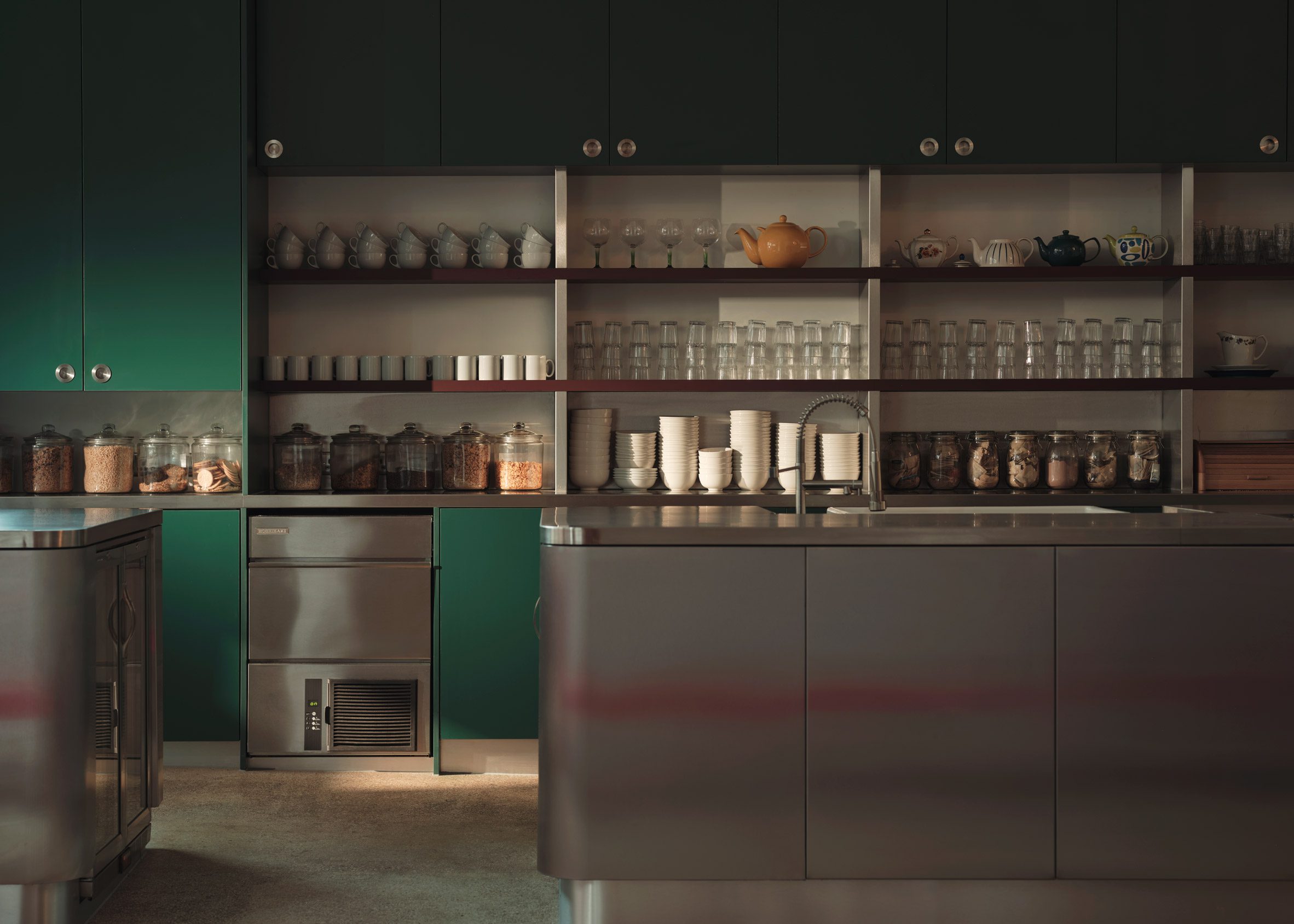
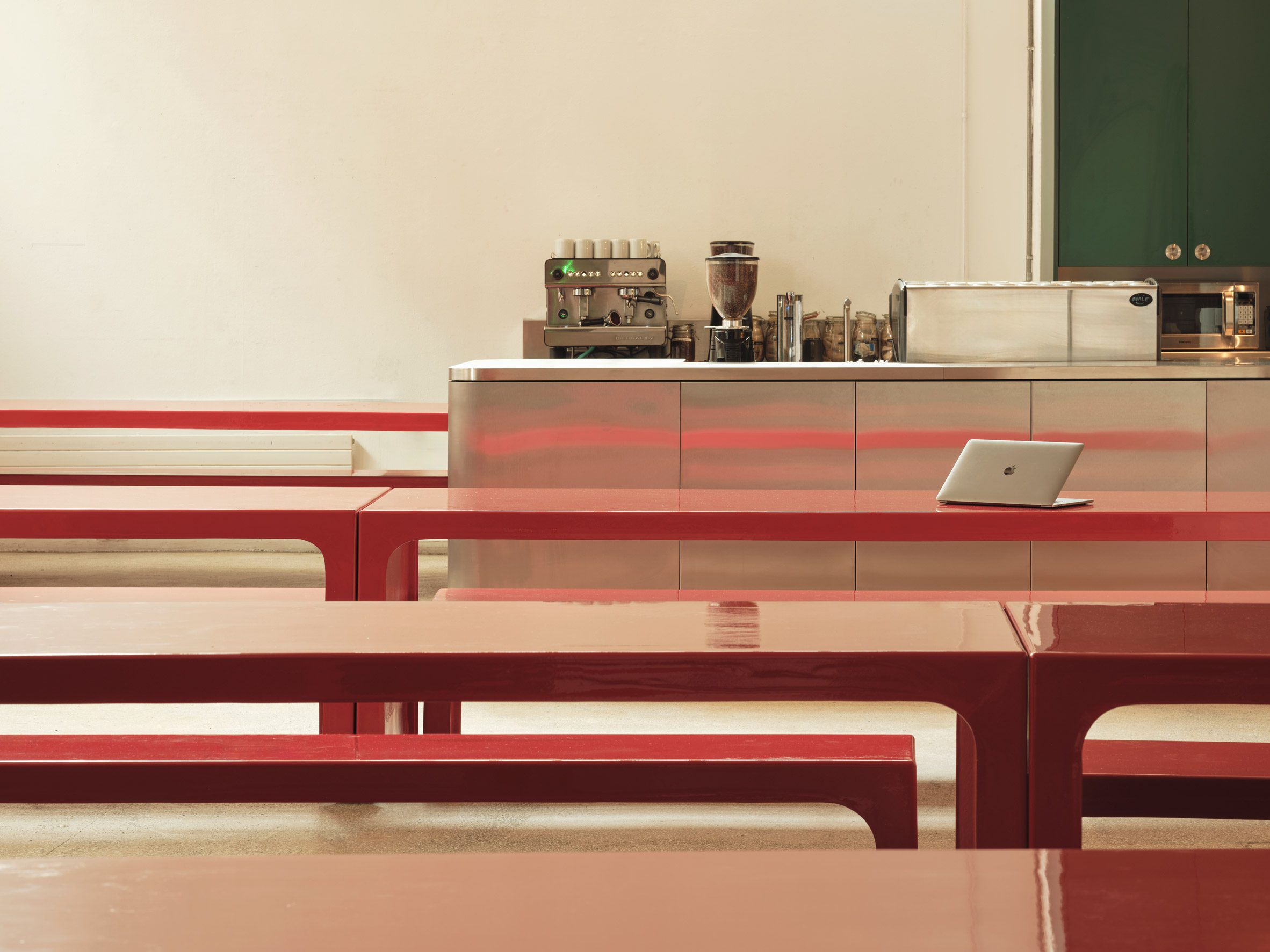
Adjacent to the dining area, an industrial-style kitchen is organised around two sleek stainless steel islands.
Deep green cabinets topped with stainless steel and red-coloured shelving feature in the kitchen and display the agency‘s extensive vintage tableware collection.
“In the kitchen, more muted shades of green and burgundy offset the clinical brushed steel counters, creating an adaptable space suited to shapeshifting from day to night,” studio co-founder Alex Holloway told Dezeen.
“Much of our scheme was shaped by materials with reflective qualities, capitalising on the natural light from the original tea factory’s windows which worked to accentuate the raw charm of the industrial setting,” he added.
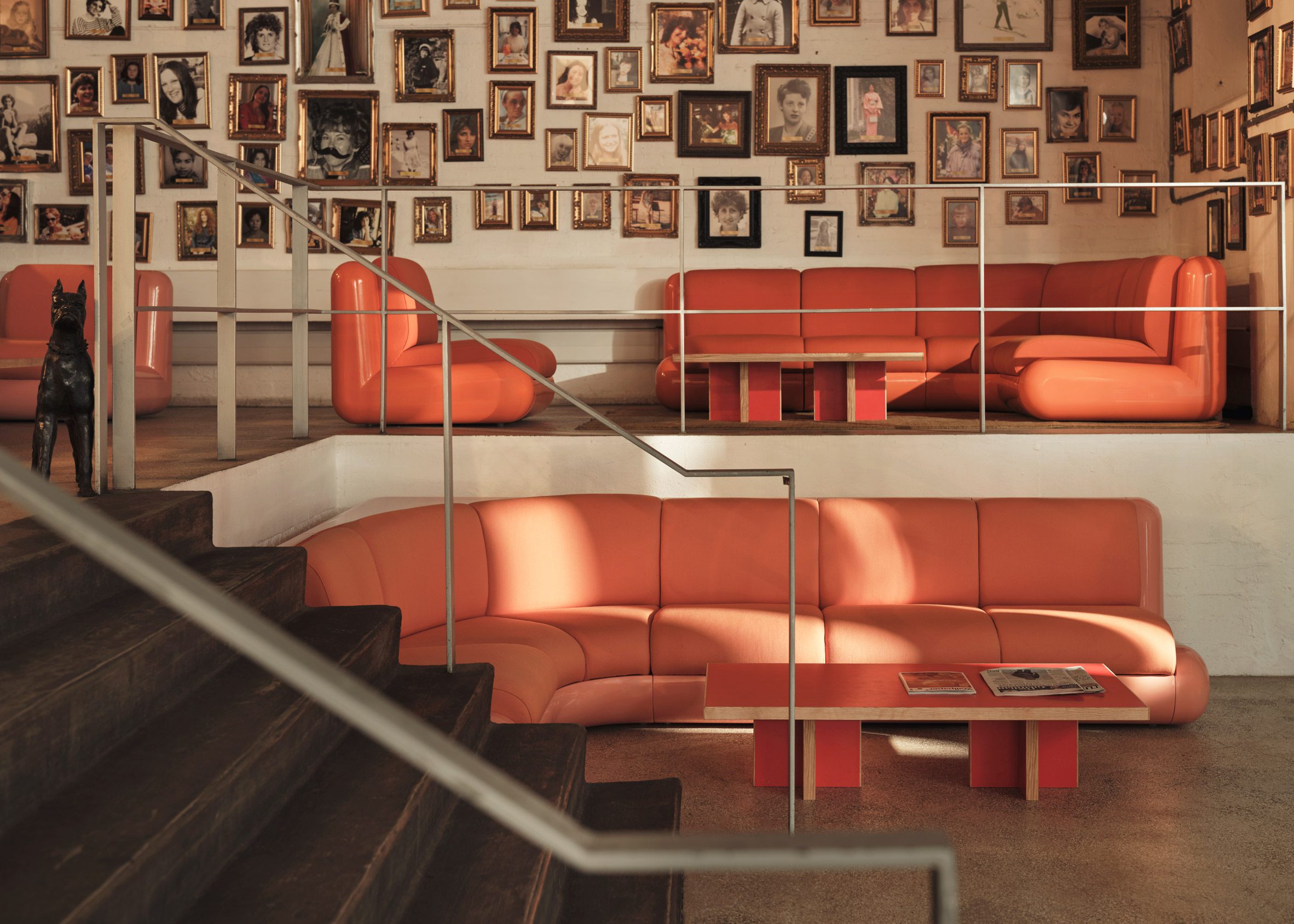
This material palette extends into the renewed 63-square-metre mezzanine area, which is furnished with playful pink sofas from Holloway Li’s T4 collection and complemented by red coffee tables made from salvaged wood.
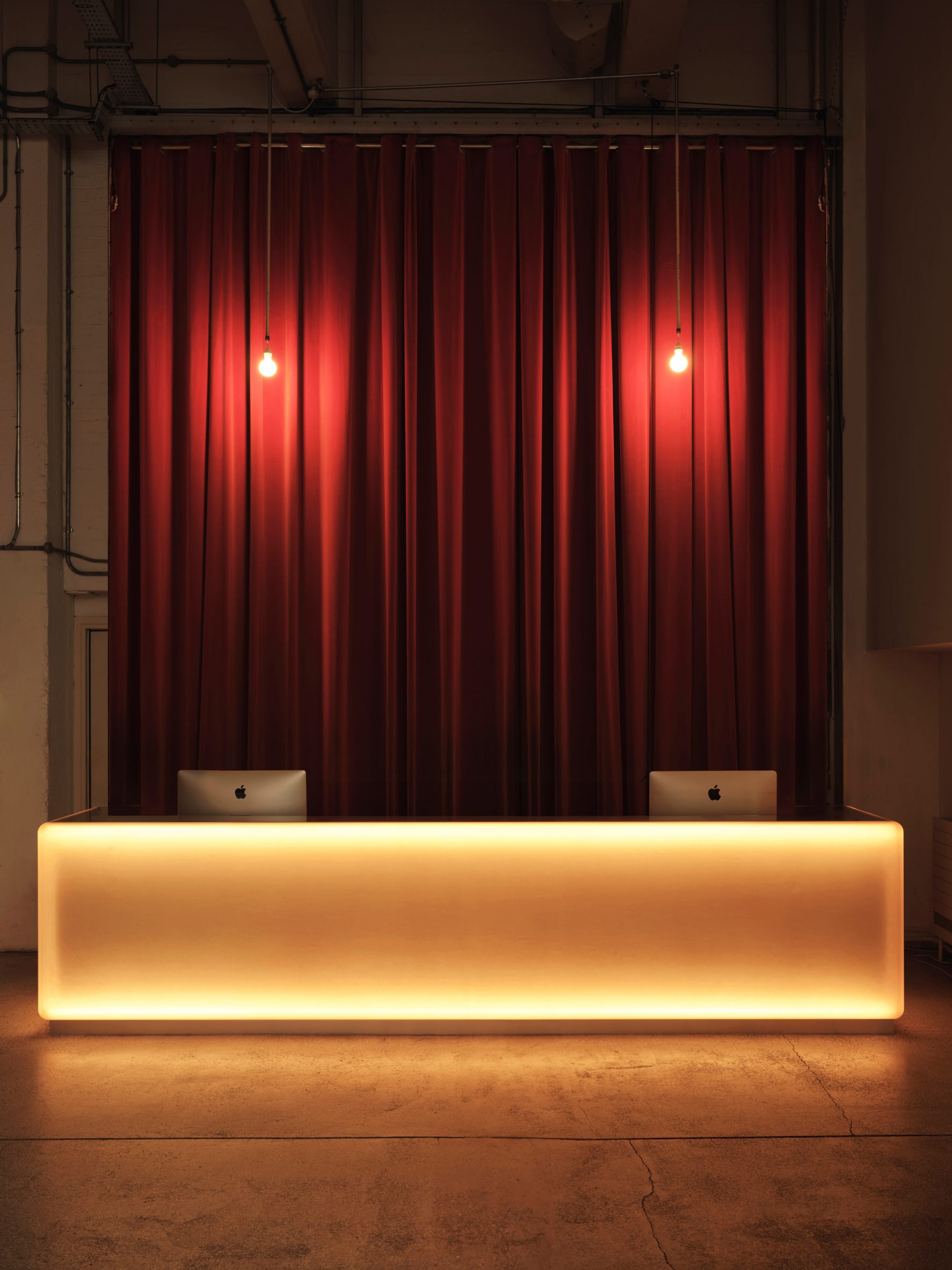
Meanwhile, at the office’s reception, the studio preserved an existing stainless steel desk and encased its structure with a translucent, glowing fascia. This is set against a backdrop of red curtains and hanging light bulbs, adding a sense of drama and theatricality to the reception area.
Holloway Li is an interior design studio founded by Alex Holloway and Na Li in 2018.
Other recently completed office interiors include the conversion of a Victorian mission church into a flexible studio in London and a Minecraft-inspired office in Prague.
The photography is by Felix Speller.
Project credits:
Interior design: Holloway Li
Design team: Alex Holloway, Ivy Aris, Jazzlyn Jansen
Project manager/ QS: Holloway Li
Contractor: Craftworks Productions
Metalwork: Steel & Form
Joinery: Craftworks Productions
Furniture procurement agent: Holloway Li
Bespoke furniture (T4, Big Red, Reception Desk): Uma Objects
The post Holloway Li furnishes Mother London office with bold-coloured furniture appeared first on Dezeen.

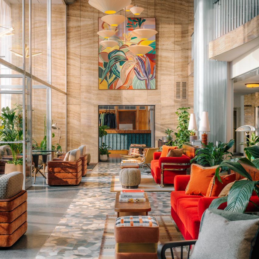
The first and only skyscraper designed by Finnish-American architect Eero Saarinen in New York City has undergone a renovation by Vocon Architects and MdeAS Architects to help it “meet the expectations of today”.
At the behest of developer HGI, local architecture studios Vocon Architects and MdeAS Architects renovated and restored the 51W52 skyscraper, also known as Black Rock, which was completed as a headquarters for American media giant CBS in 1964.
CBS moved all of its facilities out in late 2023 and Black Rock now contains offices for a variety of companies, including HGI itself.
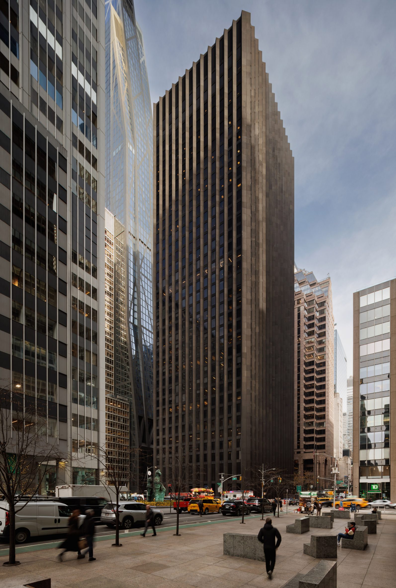
Designed by modernist architect Saarinen as his first and only skyscraper, 51W52’s original symmetrical facade of granite, bronze and travertine has survived, with the bronze fins updated by the renovation team.
At the time, Saarinen called it the “simplest skyscraper statement in New York”.
The original design was mostly maintained, and the developer, which purchased the landmarked building in 2021, said that the relatively column-less floor plans made it a perfect candidate for a contemporary office, though the interiors needed an update.
“From the beginning, we understood the immense potential of 51W52 given its architectural significance, desirable floor plans, and central location in Midtown,” said HGI president T Richard Litton Jr.
“The structure of the building was optimal, we just needed to make subtle enhancements to reflect and appreciate its original design.”
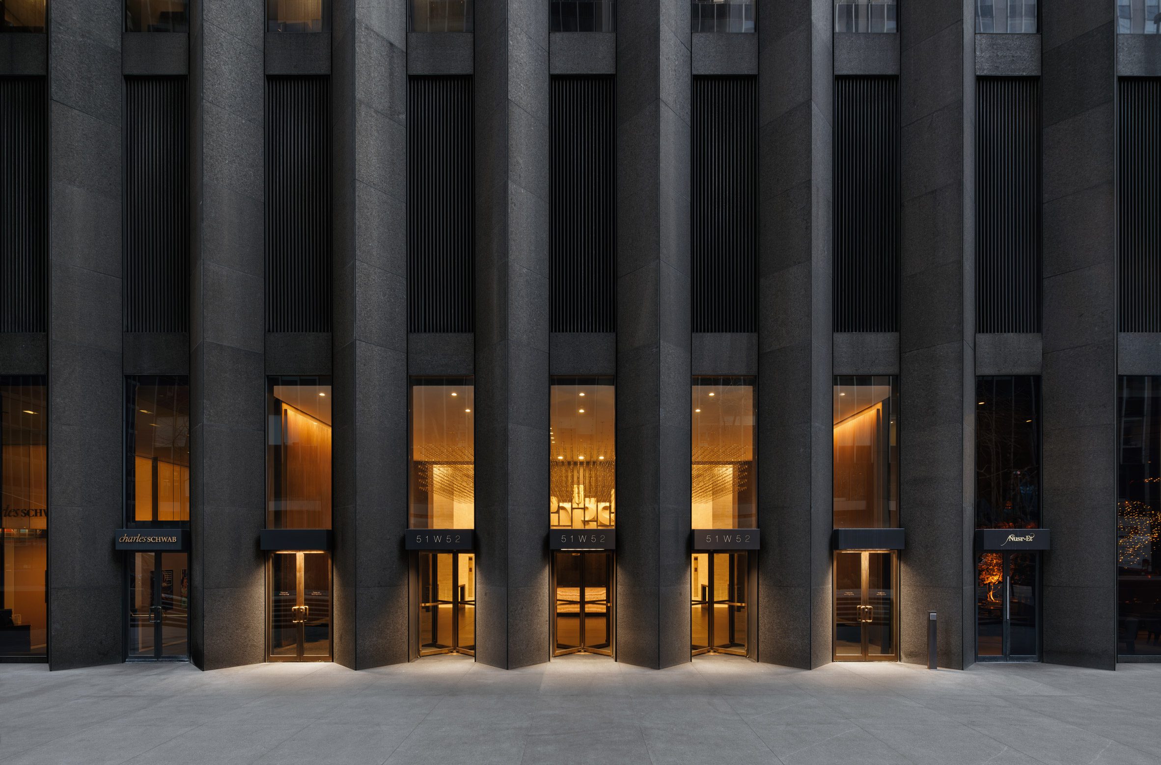
Most of the structural elements in the building were left intact. The architectural team completely renovated two lobbies on the ground floor, including a revamp of the finishes and the elevators. They also redid the building’s rooftop garden.

The project also included the renovation of key amenities spaces including a lounge, fitness centre and a private cafe.
The studios said that instead of completely rethinking the aesthetics of the 900,000-square-foot (83,600 square-metre) building, they aimed to “let the significant architecture speak for itself”.
The wide, long walls of the lobby were finished in detailing that echoes those used for the original facade. Some of the walls were covered in brass-tipped wooden slats, while others feature monolithic granite slabs.

Back-lit stone clads the reception desk, above which was placed a modernist fresco that incorporates the CBS logo to call attention to the history of the building.
This artwork, by artist Vincent Ashbahian, was originally displayed in the building in the 1970s and willed back to the building after his death.
Toronto outfit Viso created a massive lighting fixture made of dangling lights on strands to cover a large swath of the lobby.
“By conceptualizing the experience from the outside in, we were able to restore the fundamental beauty of his design and apply the principles of form, light, and even water to new elements such as the feature stair and water feature that meet the preferences of contemporary office users,” said MdeAS Architects managing partner Dan Shannon.
From the lobby, a glass-lined stairwell leads down to lounge areas. The stairwell shaft is clad in stainless steel rendered in an undulating pattern.
Models of furniture originally designed by Saarinen and architect Florence Knoll were placed throughout the renovated spaces.

As it leads to lounge areas below, it passes over a small, still water feature: a small pool of water retained by black-painted metal.
“The creation of private lounges, a conference center, and fitness studios help the building meet the expectations of today’s best corporate talent, while their designs maintain the integrity of Saarinen’s original architecture,” said Vocon Architects principal Tom Vecchione.
Saarinen is known for his modernist architecture, with built work across the United States and Europe. Recently, a number of his buildings have been undergoing renovation, including his TWA terminal at JFK, which was repurposed into a hotel.
Other modernist skyscrapers that have undergone restorations and renovations in New York City include the famous Lever House skyscraper, which was restored by SOM, its original architects.
The photography is by Colin Miller.
The post Eero Saarinen's Black Rock skyscraper refurbished in New York appeared first on Dezeen.
30 Apr, 2024 | Admin | No Comments
Hemingway Design and James Shaw create furniture from recycled clothes for Traid
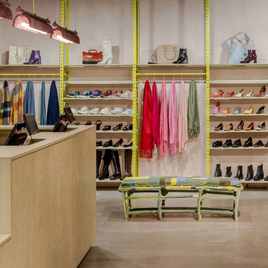
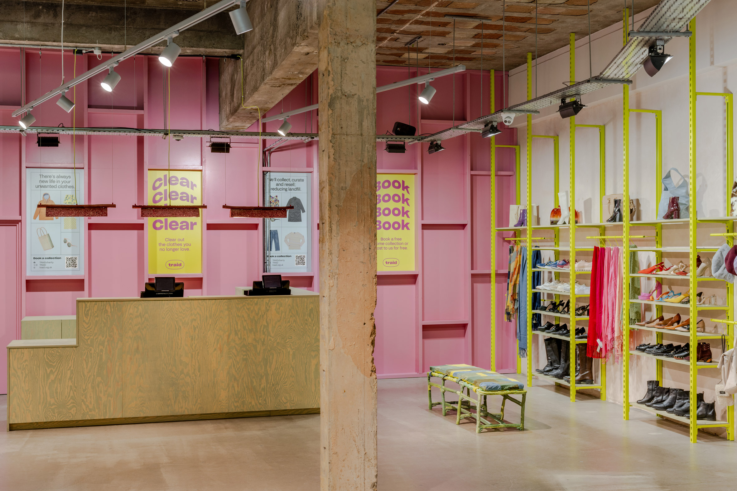
Local studio Hemingway Design collaborated with designer James Shaw to transform a London store interior for charity retailer Traid, which features colourful furniture created from leftover second-hand clothes.
Hemingway Design renovated Traid‘s Shepherd’s Bush branch as part of a wider rebrand for the retailer to mark its 25th anniversary, including its visual identity.
Traid sells donated clothing and accessories in 12 stores across London to fund global projects that tackle the issues caused by producing, consuming and wasting textiles.
As part of the Shepherd’s Bush store refurbishment, Hemingway Design worked with Shaw to create furniture out of poor-quality clothes salvaged from the Traid sorting warehouse that the retailer deemed unsellable.
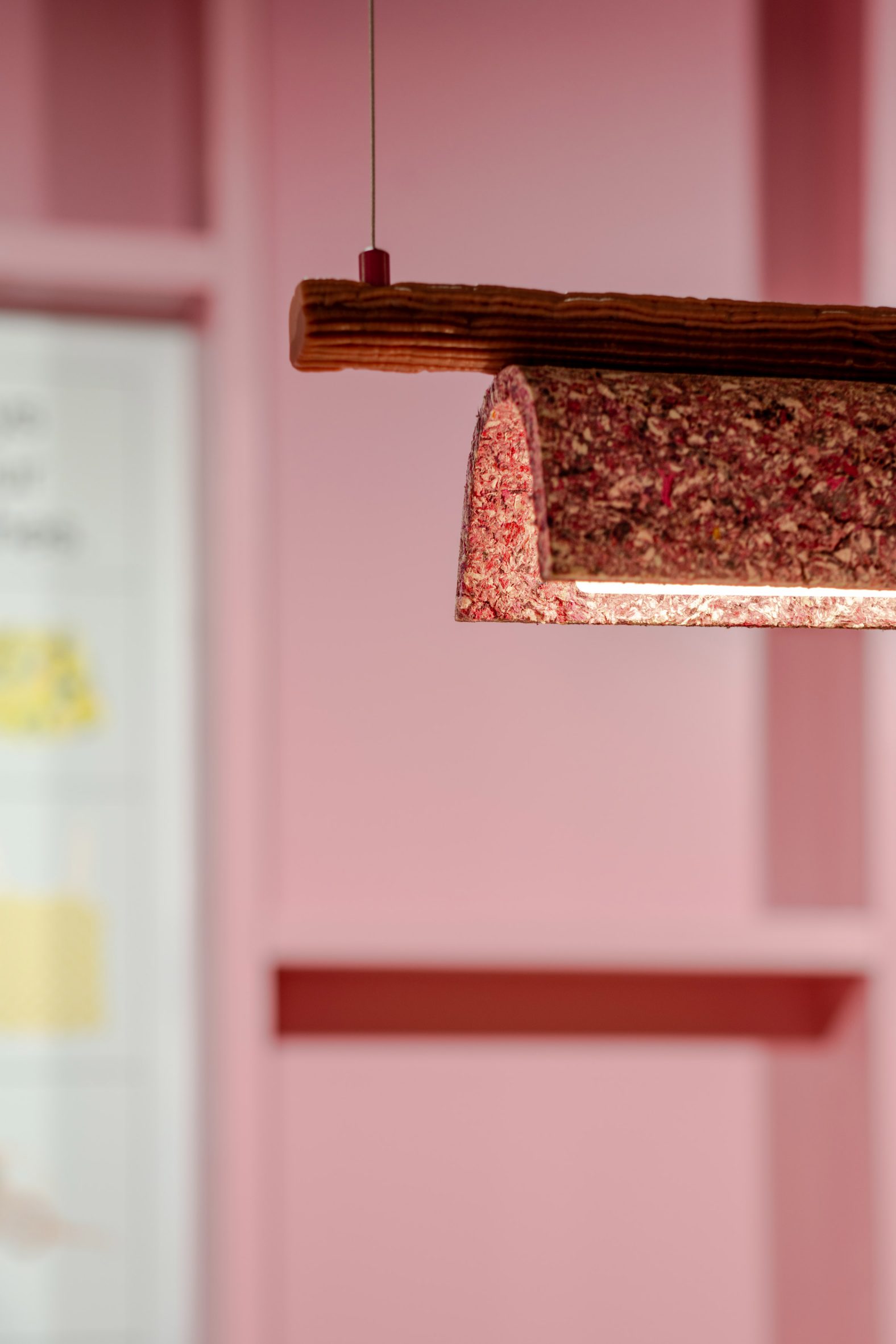
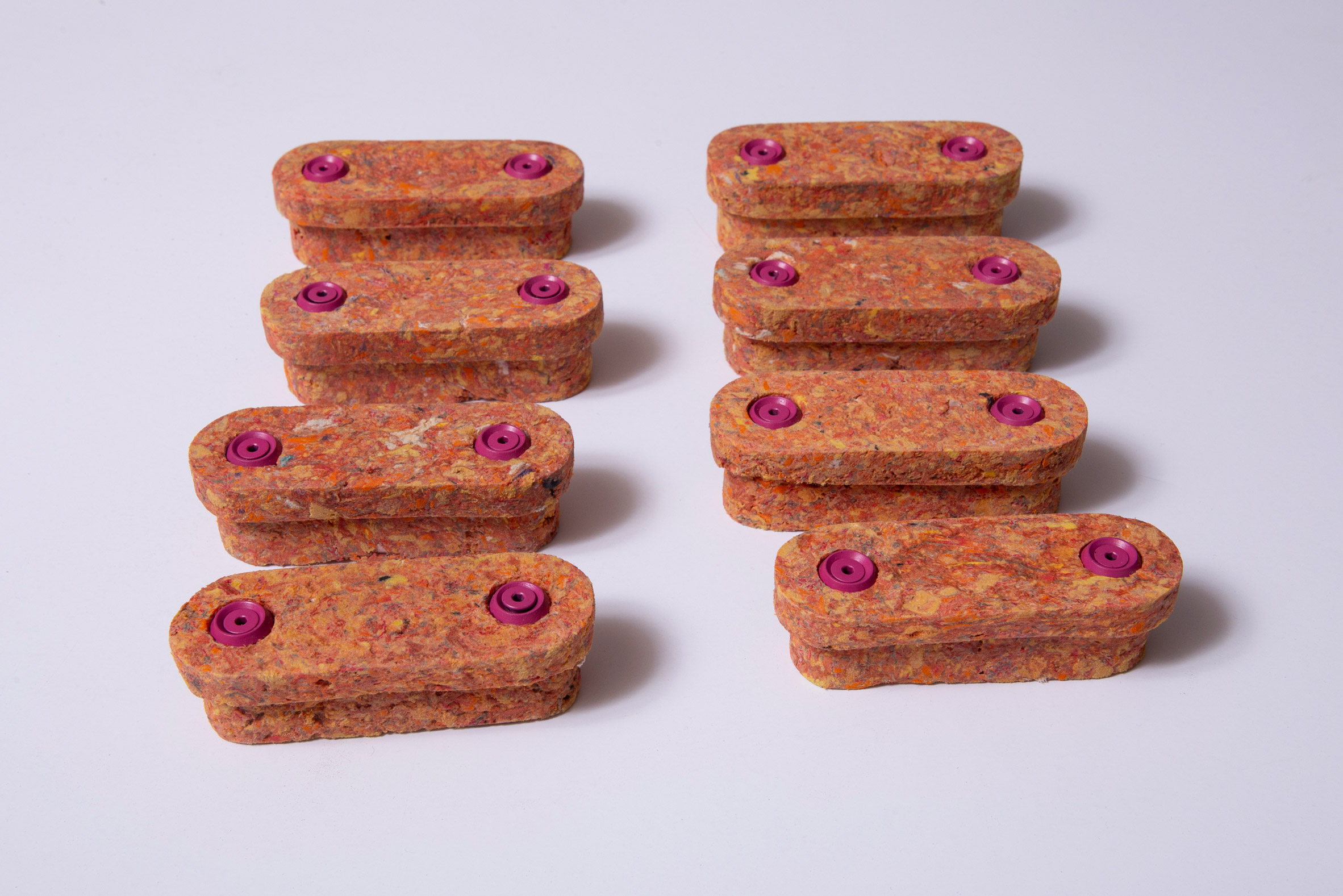
Shaw, whose practice centres on repurposing waste materials, created curved pendant lighting from the leftover clothes, which were shredded back to fibres and combined with a plant-based binder.
The designer applied this method to make the rest of the furniture. One piece is a low-slung bench for trying on shoes, upholstered with a yellow, green and blue patchwork of old denim jeans and corduroy trousers.
Shaw designed the bench’s lumpy legs in his trademark extruded HDPE plastic, finished in the same colours as the patchwork seat.

Elsewhere in the store, boxy pinewood changing room doors feature multicoloured handles created from the leftover clothes, defined by a speckled appearance thanks to the combination of shredded fibres.
Silver scaffolding previously used for a different purpose in the original shop layout was used to create a “staff picks” clothes rail positioned at the front of the store.
“To align with Traid’s manifesto of reducing waste and prolonging the lifespan of items, a fundamental objective of the refurb was to reuse and repurpose existing fixtures and fittings within the store where possible,” explained Hemingway Design.
British designer Charlie Boyden created chunky pastel-hued plinths from other offcuts and materials salvaged from the strip-out. They display merchandise in the shop window illuminated by more of Shaw’s clothing-based pendant lighting.
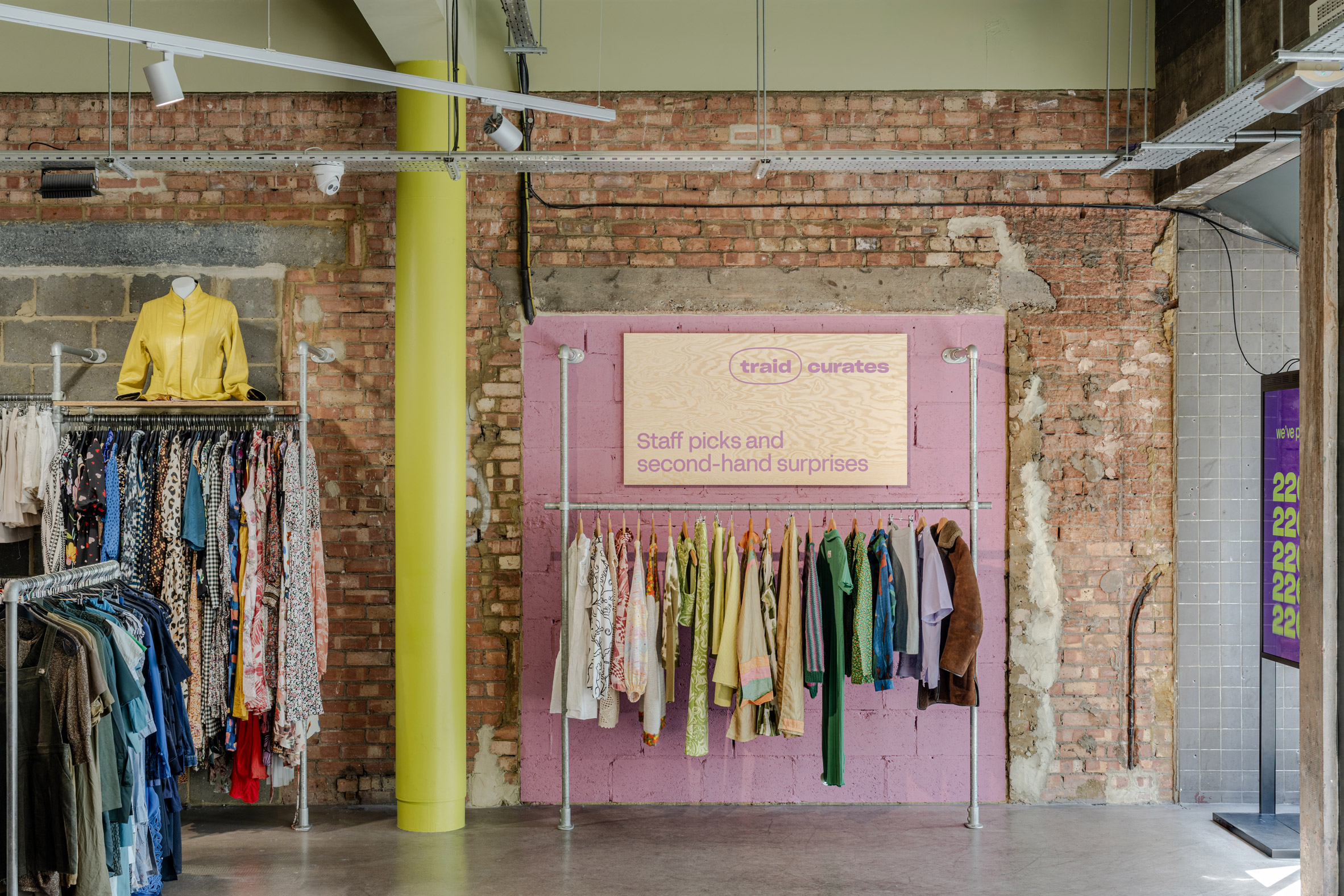
Swirly linseed-based oil-stained pine also characterises the geometric cash desk, fitted with an accessible counter and positioned in front of an existing timber stud wall painted in bold pink.
Next to the counter, bespoke bright green Unistrut shelving creates additional space for hanging clothes and displaying shoes.
According to Hemingway Design, Traid has put 228 million garments back into use to date, saving 622,059 tonnes of carbon dioxide and 105.3 million cubic metres of water.
“The charity retailer maximises the potential of the clothes you no longer wear, demanding change from a throwaway, fast fashion culture that continues to destroy this planet,” said the studio.

Shaw recently applied his extruded plastic designs to another store renovation in central London for shoe brand Camper, which includes a jumbo foot sculpture.
Hemingway Design previously created a minimalist but colourful logo to celebrate 100 years of the Dreamland amusement park in Margate, Kent.
The photography is by French & Tye unless stated otherwise.
The post Hemingway Design and James Shaw create furniture from recycled clothes for Traid appeared first on Dezeen.
29 Apr, 2024 | Admin | No Comments
The Hoxton Vienna offers “contemporary take on the Wiener Werstätte arts and craft movement”
AIME Studio’s interiors for the latest outpost of The Hoxton hotels, in a renovated marble-clad 1950s office building in Vienna, celebrate arts and crafts and post-war modernism.
Creative studio AIME Studio has converted the former administration building of the Chamber of Commerce in Vienna, which was originally designed by architect Carl Appel, into The Hoxton Vienna.
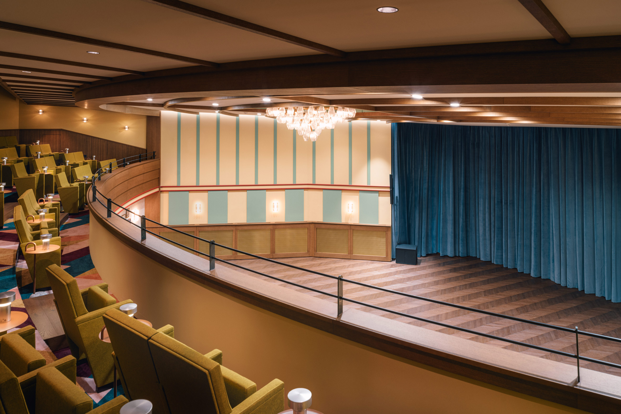
The building now features 196 rooms, a rooftop bar and swimming pool, a restaurant, cocktail bar, a private apartment and an auditorium for events and programming.

By focussing on mid-century Austrian design, the hotel aims to show guests a less classical side of what is often considered a traditional European city.
Appel was known for shaping the “Second Ringstrasse” style of the post-war reconstruction period, which the studio referenced in its design.
“Our aim was to create a design that respected the building’s history and to preserve the architectural style of the 1950s,” AIME Studios’ Aaron Gibson told Dezeen.

“We visited buildings in Vienna designed by Carl Appel and renowned Austrian architects of the early 20th-century – like Adolph Loos and Otto Wagner – which inspired the interiors for The Hoxton Vienna,” Gibson added.
The double-height lobby of The Hoxton Vienna preserves key features and details from Appel’s original 1950s design.

The mid-century finishes of stones and metals in the original office building set a neutral and semi-industrial context for the renovation.
“We deliberately used the key features and details from Carl Appel’s original design for the architecture and the interior as a basis for our decision-making throughout the ground floor,” the studio said.

AIME Studios also worked with The Federal Monuments Authority Austria, which enforces the Monument Protection Act in order to explore, protect and maintain Austria’s cultural heritage.
Together they selected furniture items for the hotel which reflect the 1950s, including light fittings, armchairs, sofas, and even the fabrics and textiles used in the space.

“We inherited amazing existing features like the large format terrazzo flooring, travertine walls and corrugated aluminium columns, which are all great examples of 1950s architecture,” AIME told Dezeen.
The interior scheme complements the existing restrained colour palette of the natural stones’ soft hues of green-grey, beige and blue tones.
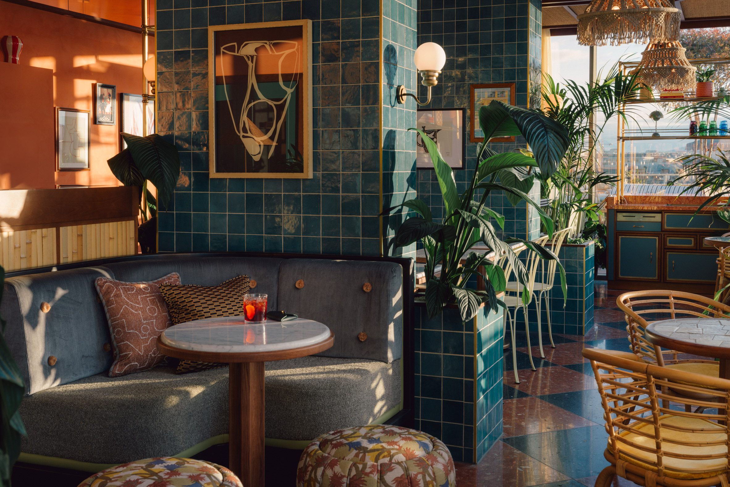
The studio also took inspiration from the Wiener Werkstätte (Viennese workshops), one of the longest-lived design movements of the 20th century and a key organisation for the development of modernism.
Centred in the Austrian capital, it bridged traditional methods of manufacture and avant-garde aesthetics.
In the bedrooms, geographic patterned curtains are influenced by iconic Werkstätte fabrics and ruched headboards are inspired by Loos’ style.
“We selected Viennese fabrics with restrained colours and quiet and small-scale patterns, demonstrating a contemporary take on the Wiener Werstätte arts and craft movement,” Gibson explained.
Besides the usual hotel program of rooms and restaurants, The Hoxton Vienna features a large auditorium designed in a 1950s palette of pale yellow and blue with mid-century wood panelling, furniture and fittings.
The auditorium will host events like stand-up comedy, gigs and conferences, as part of the wider cultural programming of The Hoxton Vienna.
The hotel also has a private “apartment,” which is an open-plan series of rooms across different levels, including kitchen, dining, sitting and meeting spaces.

The interiors of the apartment distil the essence of AIME Studios’ interior design at The Hoxton, with Wiener Werstätte patterns and colours, mid-century modernist furniture and light fittings, and artwork referencing the period.
Other hotels from The Hoxton that have recently featured on Dezeen include their first opening in Germany with The Hoxton Charlottenburg in Berlin and the Ricardo Bofill-inspired The Hoxton Poblenou in Barcelona.
Photography is by Julius Hirtzberger.
The post The Hoxton Vienna offers "contemporary take on the Wiener Werstätte arts and craft movement" appeared first on Dezeen.
29 Apr, 2024 | Admin | No Comments
Jane Withers picks five projects that don't “take water for granted” from MK&G exhibition
An exhibition at Hamburg’s MK&G museum examines the global water crisis and what architects and designers can do to help. Here, curator Jane Withers selects five highlights from the show and explains the stories behind them.
Water Pressure: Designing for the Future is the result of several years of research by Jane Withers Studio, which involved compiling a broad range of ideas on how to confront water scarcity from the fields of design, science and activism.
“The current water crisis is largely the result of mismanagement and overconsumption, so there is potential to rethink the systems,” Withers told Dezeen. “A multidisciplinary approach is required and architecture and design are strong components within this.”

The exhibition, on show at MK&G until 13 October, is organised around five themes: Water Stories, Bodily Waters, Invisible Water – Agriculture and Industry, Thirsty Cities, and Ecosystems – Land and Ocean.
Each theme explores water as a life force and a common medium that unites humans, plants, animals and the landscape.
“We take water for granted in every way and we need to rekindle our psychological, physiological and spiritual understanding of it,” Withers said.
The projects on show range from the CloudFisher system, which harvests water from fog or clouds, to a proposal for low-cost floating schools by architecture studio NLÉ and a mural by Slovenian architect Marjetica Potrč calling for the recognition of water as a living being.
While some reflect on water’s poetic and mythical associations, others offer more scientifically-led solutions to specific problems associated with water scarcity, human-induced climate change and water justice.
Withers said she hopes visitors to the exhibition will leave with a better understanding of water and the challenges we face, as well as recognising that there are things we can all do to help shape a different future.
“We need policy change but also individual changes of mindset and a new water consciousness,” she added. “We’re very keen that the exhibition is a starting point for conversations and for campaigning about water culture.”
Below, Withers outlines five key projects featured in Water Pressure:
Time on the Lachlan River by Marjetica Potrč
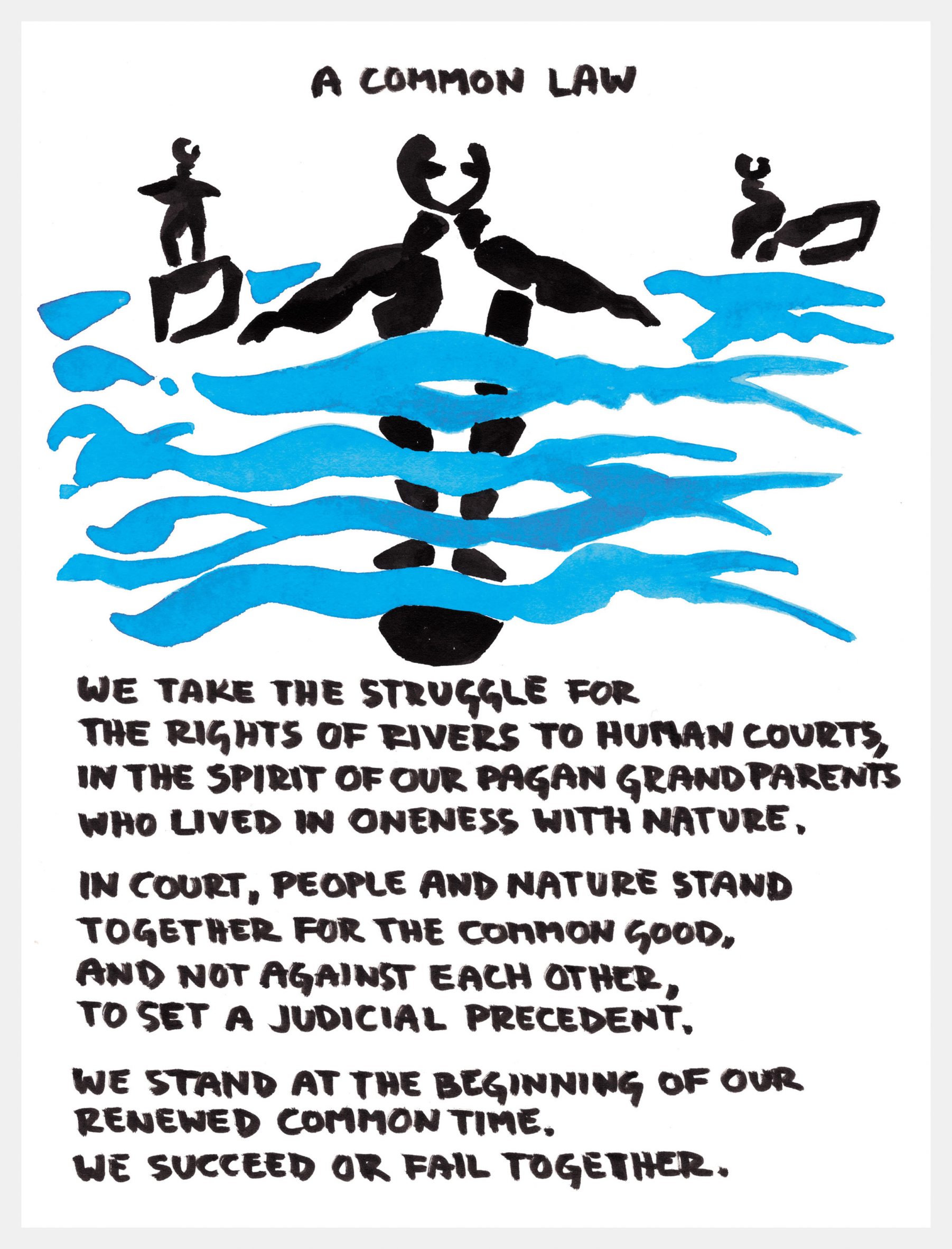
“The first room in the exhibition is framed by two wonderful works by artist and activist Marjetica Potrč. The mural Time on The Lachlan River illustrates the campaign by Australia’s Aboriginal Wijaduri people to prevent the enlargement of a damn that could have deprived the land downriver of water.
“On the other side, the visual essay The Rights of a River tells the story of a water referendum in Slovenia in 2021, when an overwhelming majority of people voted against a law that would have allowed private businesses to exploit the country’s rivers for profit.
“This shift in thinking about rivers and how we view them not as objects to be exploited but as subjects with their own rights is fundamental to creating a more equitable water culture and sets the tone for the exhibition.”
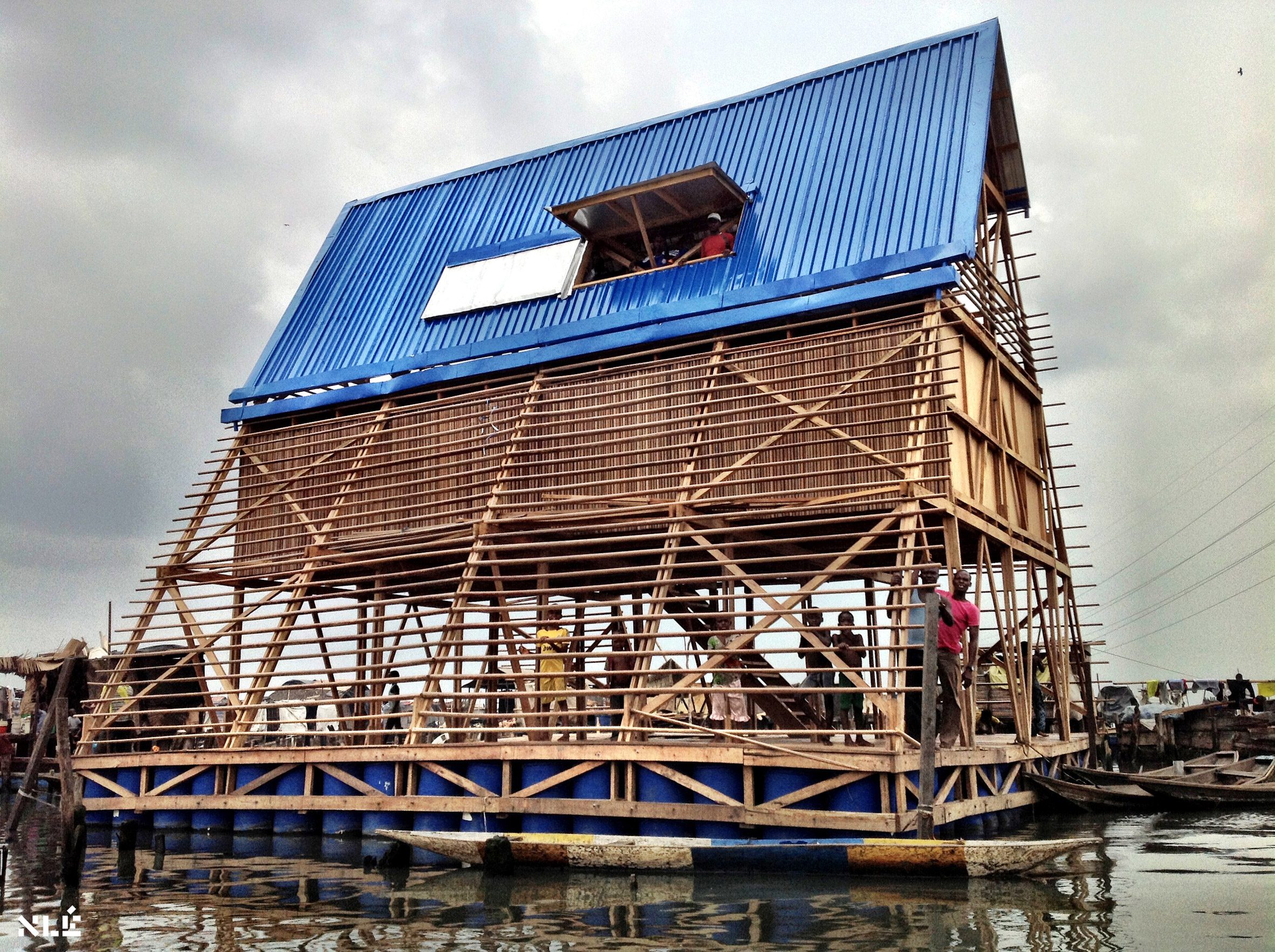
Makoko Floating System by NLÉ
“Architectural practice NLÉ has been researching the potential for floating architecture in African cities affected by rising sea levels for over a decade. Their prototype floating building was a low-cost school for the Makoko community in Lagos inspired by their vernacular floating structures.
“The Makoko School became something of a poster project for floating architecture through photographer Iwan Baan’s alluring images of kids clambering over an ark-like wooden building. It could have stopped there but NLÉ has gone on to develop a scalable prefabricated floating building system for the development of waterfronts amid the challenges of climate resilience.
“The studio is currently working on a regeneration plan for the Makoko area based on this technology, and recently published the book African Water Cities that examines the potential for waterborne living in other African cities.”

Death to the Flushing Toilet by The Dry Collective
“Death to the Flushing Toilet is a campaign by The Dry Collective that provokes a rethink of the waterborne sewage systems we take for granted. It’s madness that wealthier regions of the world use vast quantities of freshwater to flush away human waste, while two billion people still lack basic sanitation.
“In urban areas, as much as 30 per cent of freshwater is used to flush toilets and often this is drinking quality water. The Dry Collective aims to persuade architects and designers to use alternative systems.
“Taking the traditional Finnish huussi – a composting dry toilet used in rural areas – as a model, they produced a film set in 2043 that imagines a global shift where water is no longer wasted on flushing and human waste is recycled as fertiliser. The technology for circular sanitation systems already exists so the real issue is overcoming prejudices and the ‘yuck factor’.”

Eden in Iraq
“Eden in Iraq is an incredibly inspiring project that has gotten off the ground against the odds in Iraq’s Mesopotamian Marshes, where the discharge of untreated sewage has polluted the fragile marsh ecosystem and led to disease.
“The wetland garden is designed to use plants to clean the local community’s wastewater. The garden’s ornate symmetrical design takes inspiration from the embroidered wedding blankets of Marsh Arab tribes and their tradition of reed construction for buildings.
“The first construction phase, completed in 2023, demonstrates the potential for nature-based wastewater systems to work at a community level.”

Re-imagine Water Flows by Ooze Architects
“Re-imagine Water Flows is a special commission for the Water Pressure exhibition using the MK&G Museum as a case study to understand the water challenges Hamburg faces and how the building’s water ecosystem could be made more resilient.
“A mural by Ooze Architects shows two versions of the museum – one with its current situation marooned between massive roads and Hamburg’s main railway station and the other illustrating how it could be transformed into a shady green oasis.
“In the studio’s proposal, rainwater and wastewater are recycled to be reused for non-drinking water use inside the building, as well as for irrigating the landscape and recharging the Hamburg aquifer.
“The mural expands to show how Hamburg is threatened by drought and increased risk of flooding that could also affect the river Elbe watershed. It invites us to think about the importance of these common water flows linking countries and cities.”
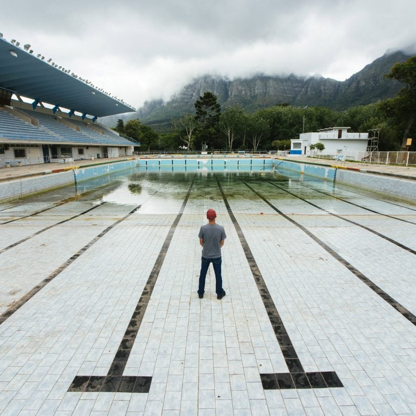
The top image is by Henning Rogge and the image of the Newlands municipal swimming pool in Cape Town is by Bloomberg via Getty Images.
Water Pressure is on show at MK&G Hamburg from 15 March to 13 October 2024. See Dezeen Events Guide for all the latest architecture and design events taking place around the world.
The post Jane Withers picks five projects that don't "take water for granted" from MK&G exhibition appeared first on Dezeen.

In this lookbook, we’ve collected eight guest rooms from China to Spain that provide visiting friends and family a space to call their own.
Guest accommodations come in a variety of shapes and sizes. Ranging from a sofa during our younger years to full-blown guesthouses later on, putting up friends and family is made better when we have a place to put them – no matter how small.
The houses and apartments below showcase the myriad ways an extra bedroom can be integrated into an interior, often doubling as an office, storage space or – in the case of a Beijing apartment – a place to enjoy some tea.
Read on below for fresh ideas on how to provide space for visitors.
This is the latest in our lookbooks series, which provides visual inspiration from Dezeen’s archive. For more inspiration see previous lookbooks featuring brightly-framed windows, tactile and organic living rooms and mezzanines that maximise usable space.
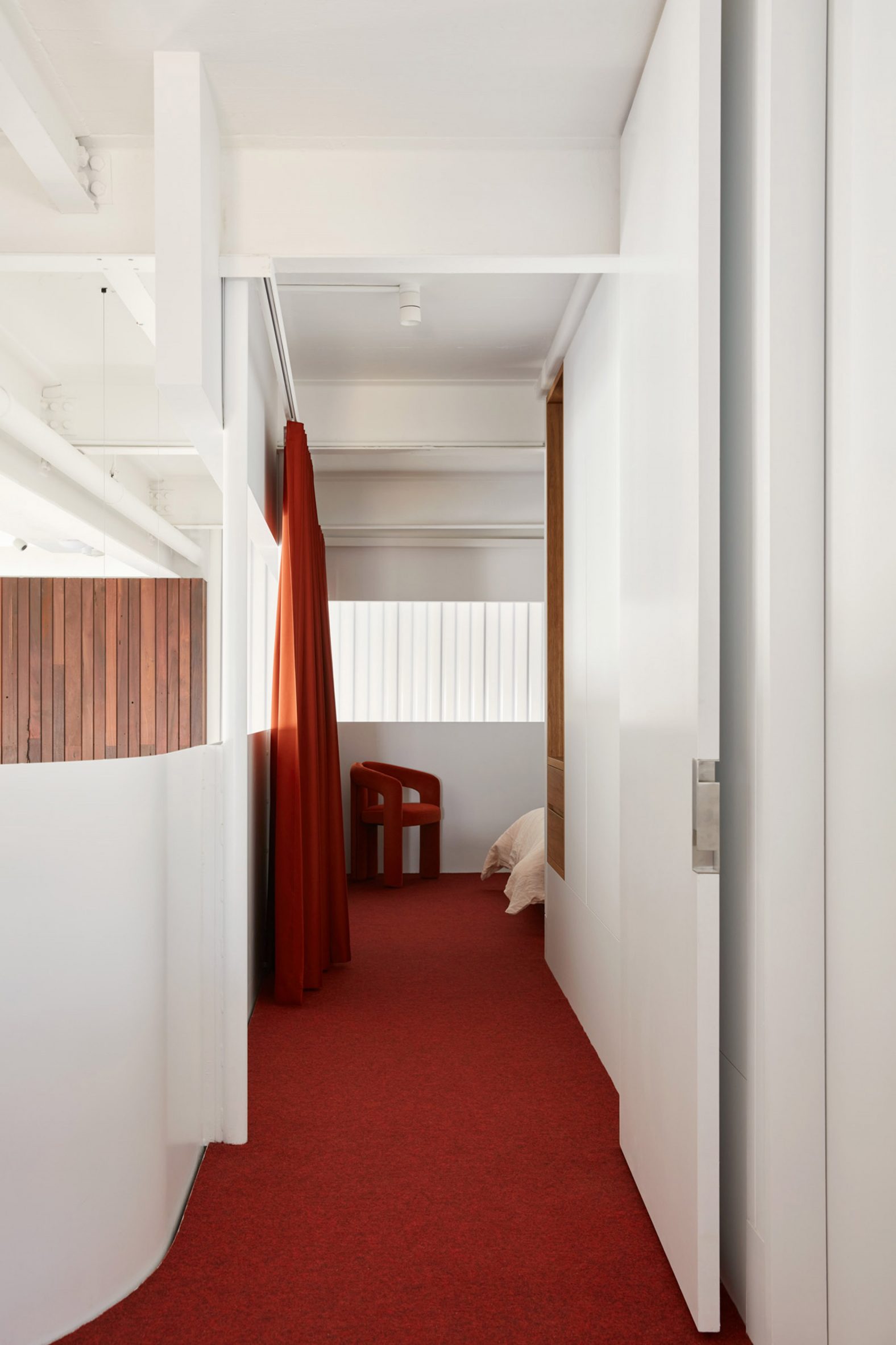
Weeties Factory home, Australia, by Spaceagency
A deep red carpet defines this guest room in a single-family Australian home, which consists of three consolidated apartments that once were part of a heritage-listed cereal factory.
The same red was carried into a curtain – which provides privacy from the living room below – and a corner chair, while built-in shelving sits at the entrance.
Find out more about Weeties Factory home ›
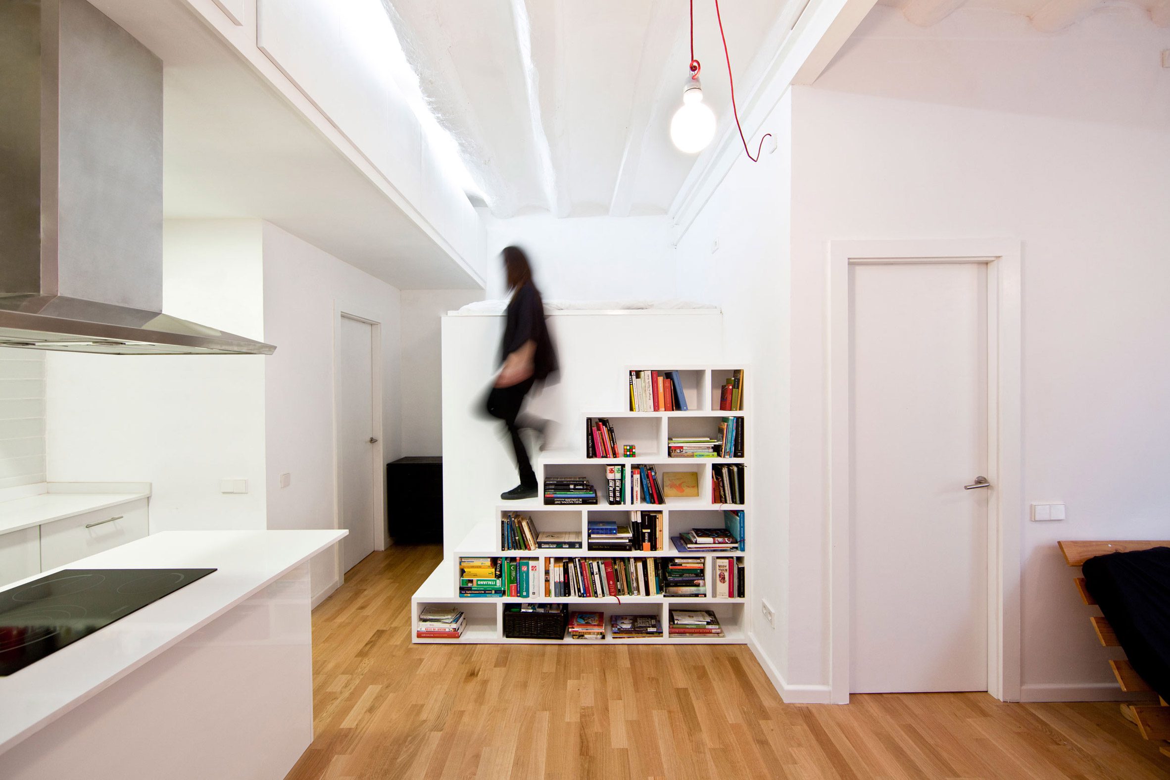
Barcelona apartment, Spain, by Eva Cotman
Guests sleep atop a platform in this Barcelona apartment, which also doubles as a storage area.
Croatian architect Eva Cotman sought to renovate the apartment to provide more open space. To optimize its functionality, she placed a bookshelf staircase in front of the guest bed.
Find out more about Barcelona apartment ›
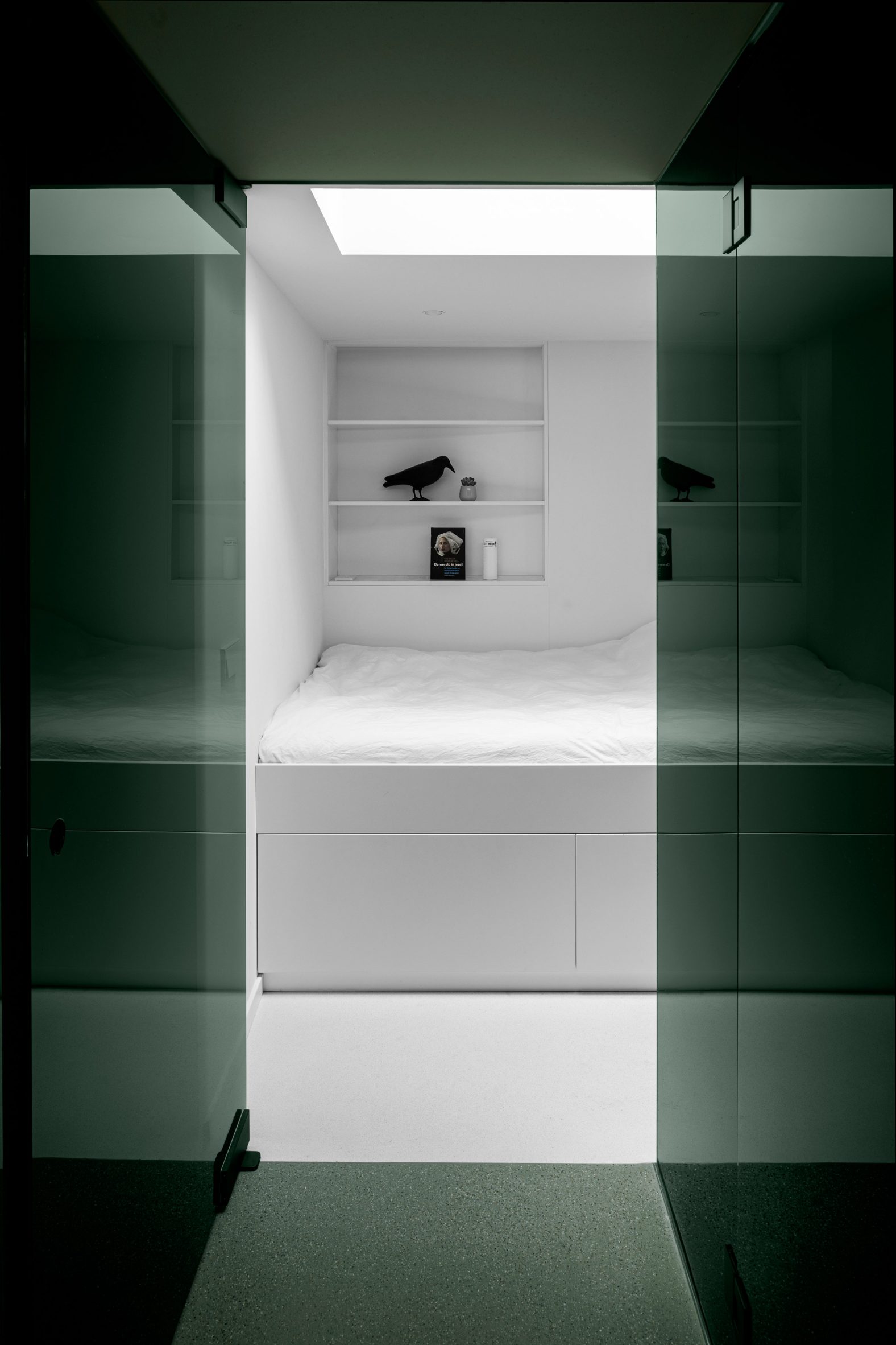
Canal house, The Netherlands, by i29
To accommodate guests in this renovation of a canal house in Amsterdam, architecture studio i29 inserted a forest-green volume off the kitchen.
The guest suite also contains its own bathroom and access door to a garden, while a built-in bed and shelving provide rest and storage.
Find out more about Canal house ›
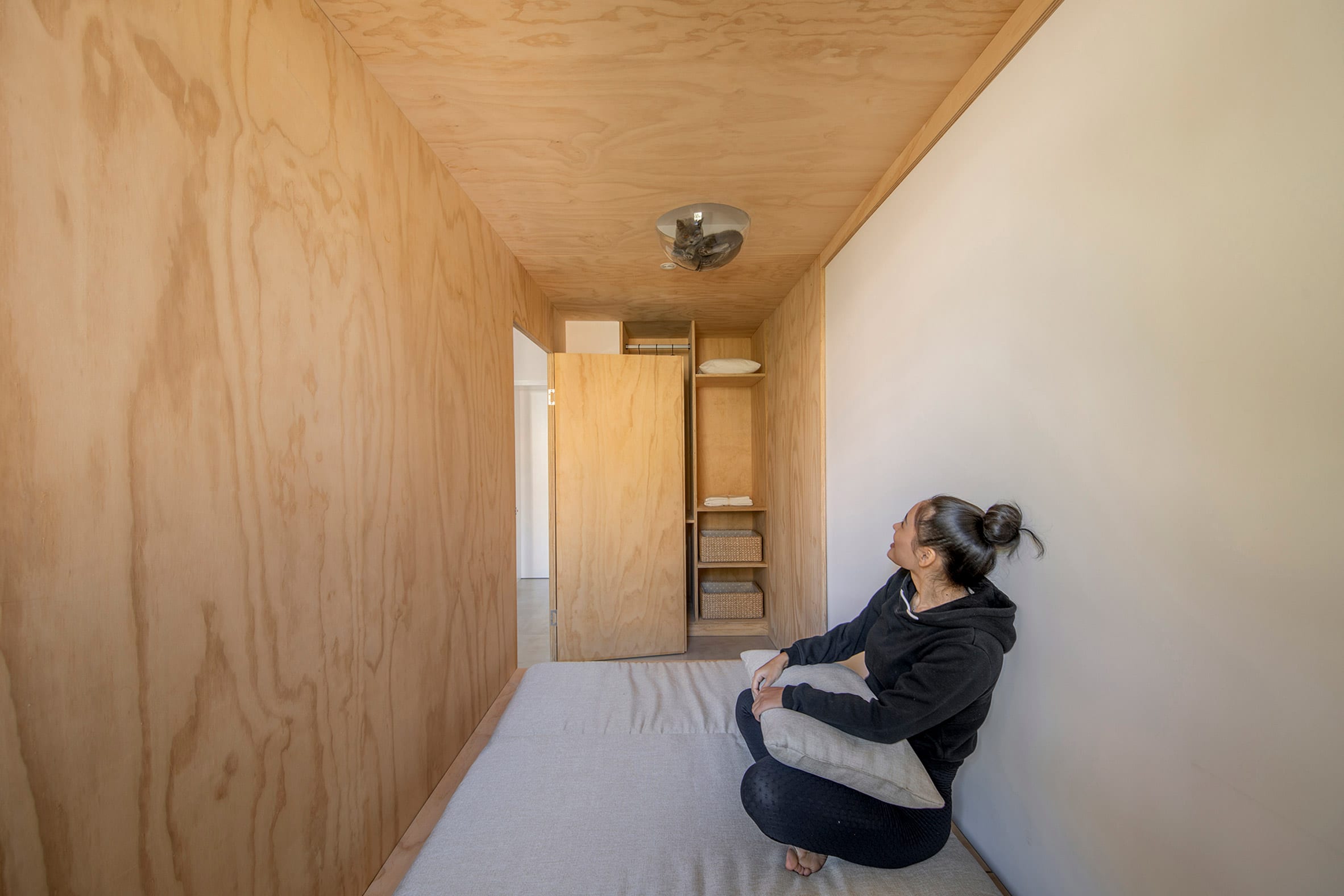
Beijing apartment, China, by Rooi
Plywood units were inserted into this 1950s Beijing apartment to organize and provide more space in its tight interior, which was created during an influx of people moving to urban areas when apartments were often compact.
A linear volume inserted along the kitchen and dining room can be used for storage, as a tea-drinking room, or as guest accommodations with a mattress placed on the floor. A bubble in the ceiling also provides a relaxing space for feline roommates.
Find out more about Beijing apartment ›
Rounded Loft, Czech Republic, by AI Architects
An attic in Prague was converted into a two-storey apartment, with living spaces, a kitchen and primary bedrooms located on the first floor and a guest suite located in a mezzanine.
In the mezzanine, a bed sits at the end of a long hall, while a bathroom sits adjacent to the stairs. A terrace in between the two spaces and skylights lining the roof provide a connection to the outdoors.
Find out more about Rounded Loft ›
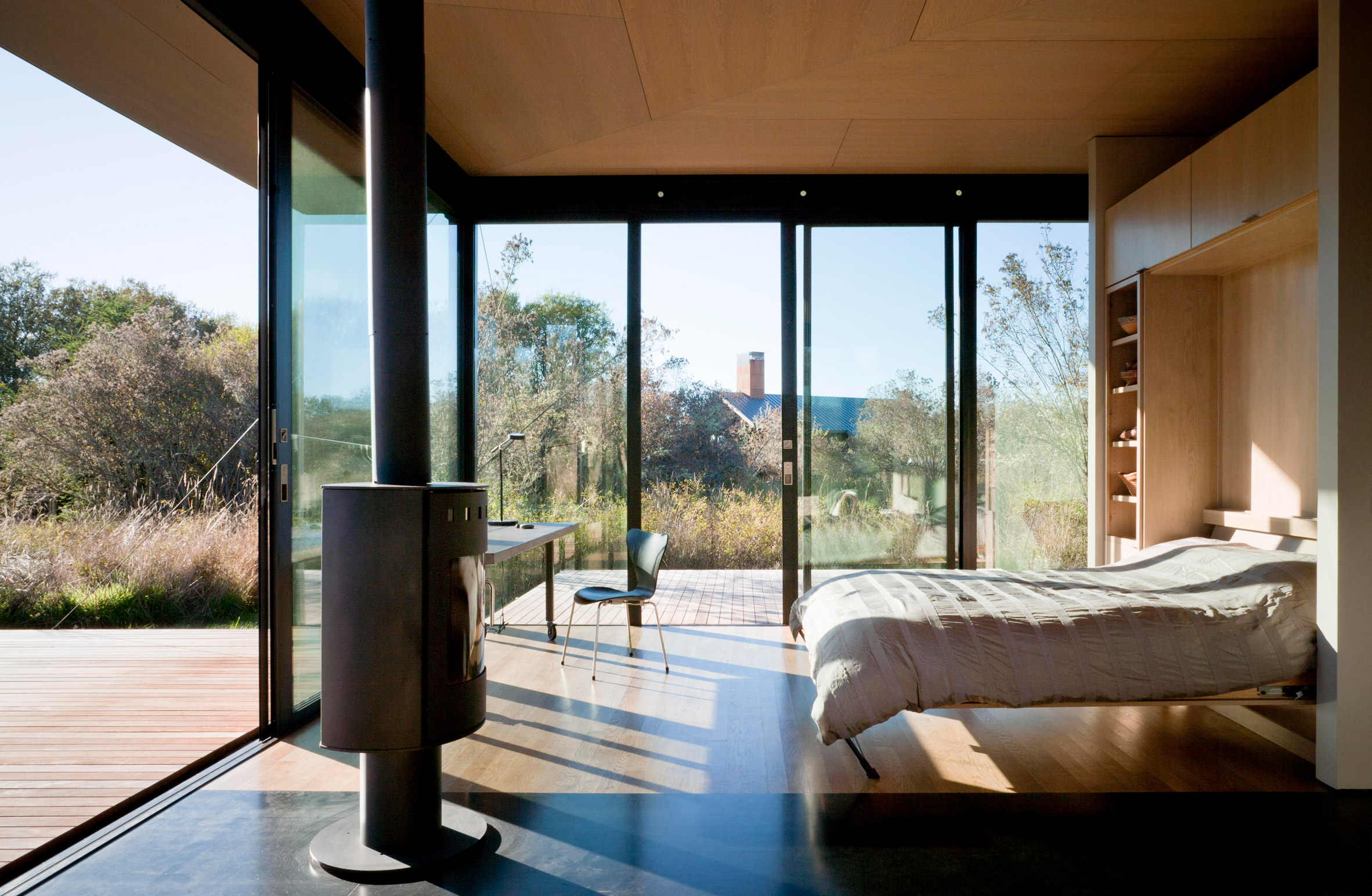
False Bay Writer’s Cabin, USA, by Olson Kundig
This cabin in Washington doubles as a study for its owners, as well as a bedroom for visiting guests when a bed is folded out of the wall.
The space is surrounded by floor-to-ceiling glass, which is protected by doors that fold up and enclose the entire cabin and fold down to create multiple porches.
Find out more about False Bay Writer’s Cabin ›
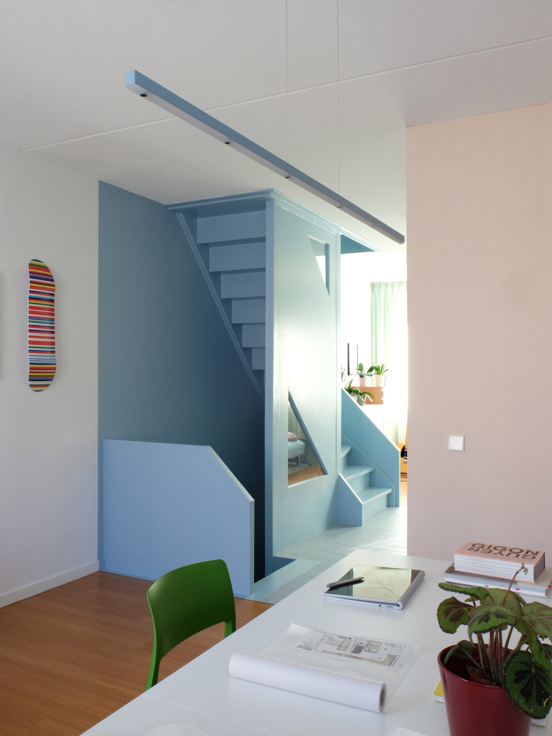
Workhome-Playhome, The Netherlands, by Lagado Architects
The founders of Lagado Architects revamped their own Rotterdam apartment by inserting a bright blue staircase and colourful storage units.
An open loft-style room sits on the second floor. This has minimal furniture so that it can be quickly turned into an exercise room or used as guest accommodations for visitors.
Find out more about Workhome-Playhome ›

Madrid apartment, Spain, by Leticia Saá
A wash area sits outside a guest bedroom in this Madrid apartment to physically and visually separate the space from the remaining house.
The guest area, which sits directly in front of the primary bed, also faces an interior courtyard which separates both sleeping areas from the living room and kitchen.
Find out more about Madrid apartment ›
This is the latest in our lookbooks series, which provides visual inspiration from Dezeen’s archive. For more inspiration see previous lookbooks featuring brightly-framed windows, tactile and organic living rooms and mezzanines that maximise usable space.
The post Eight creative guest rooms that accommodate visitors in style appeared first on Dezeen.
28 Apr, 2024 | Admin | No Comments
Studio Gameiro draws on hues of Caparica cliffs for Arriba apartment
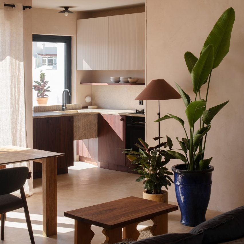
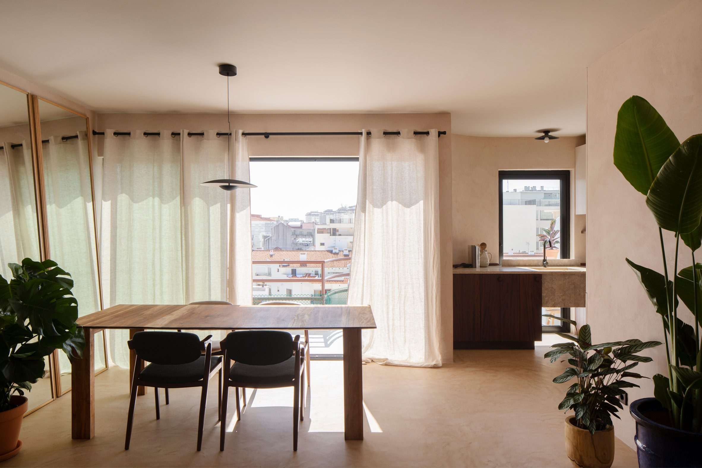
Studio Gameiro has designed the interior of the Arriba apartment in the coastal town of Caparica, Portugal, using local stone and drawing on wooden fishing huts for inspiration.
The fit-out of the two-bedroom apartment, located inside a building from the 1980s, was designed to reference the coastal area of Caparica.
“The interior colour palette and texture was inspired by the beautiful coastline of Caparica, a unique fossil-rock formation along the coast with sandy and terracotta hues,” studio founder Joāo Gameiro told Dezeen.
“This natural and protected area south of Lisbon has a particular and playful way of changing with light, and it is also almost poetically embedded in our childhood memories of long summer holidays, as it was the first seaside area close to the big city.”
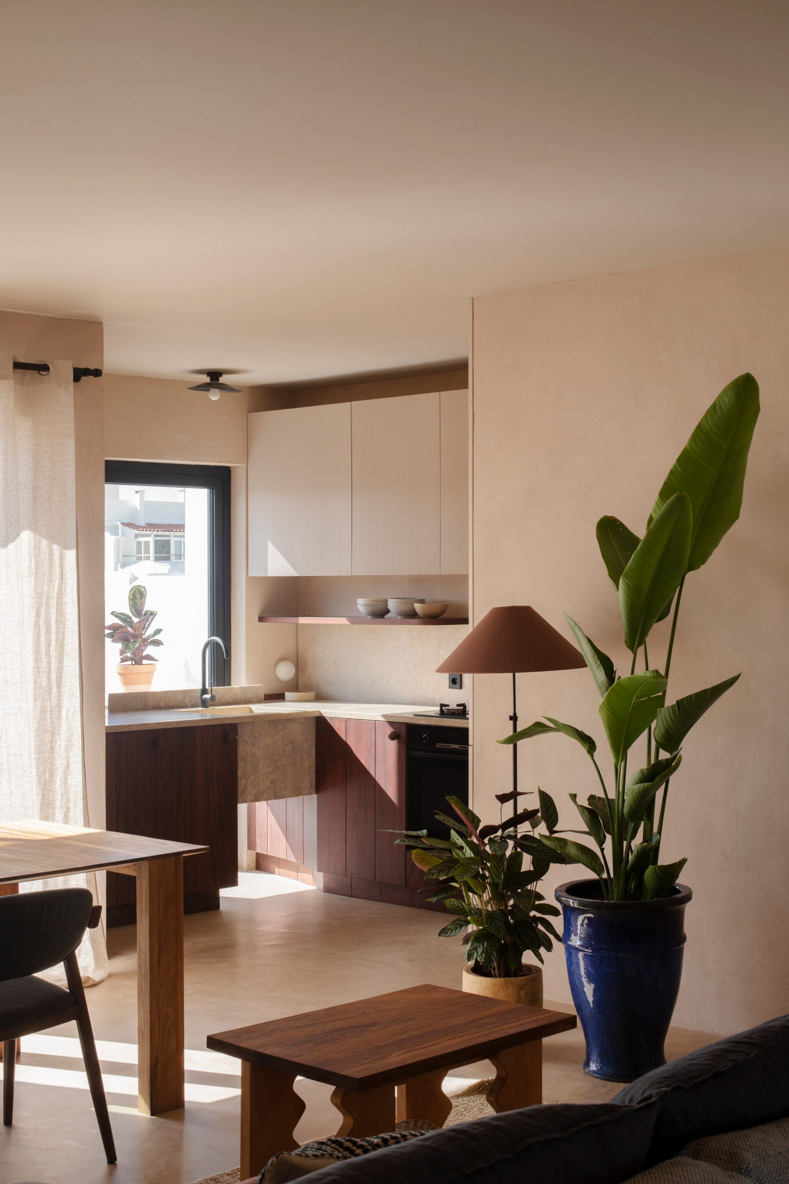
The sandy hues of the Caparica cliffs influenced the colour palette of the apartment, which is filled with beige and tan hues and named Arriba for the Portuguese word for cliff.
Studio Gameiro also referenced the 70-square-metre apartment’s surroundings through its choice of materials, designing wooden kitchen cabinets in a nod to local fishing boats.
“The use of wood for the low kitchen cabinets relates to the [area’s] fishing huts, which are characterised by vertical or horizontal lines of wooden planks,” Gameiro said.
“The texture found in the upper cabinets also finds inspiration in the same source, resembling the straw utilized in the construction of these huts.”
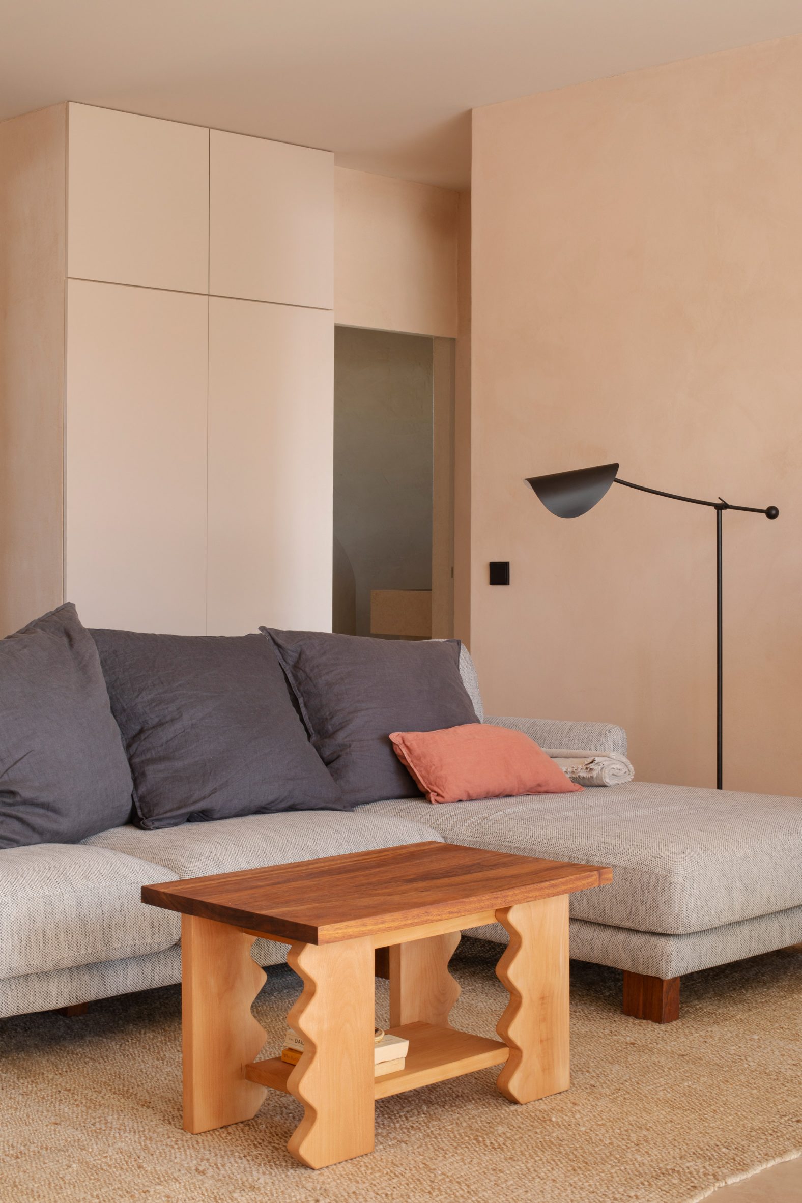
As with its interior scheme for the Austa restaurant in Almancil, the practice designed much of the furniture for the apartment, which it made from wood.
“Following the same input as in other Studio Gameiro projects, we always tend to design bespoke furniture as an extension of the ability to manipulate textures and materials and celebrate the craftsmanship we are very fortunate to work with,” Gameiro explained.
“The use of Kambala wood was important, as a reference to the durable wood used at the fabrication of the fishing boats, for example.”
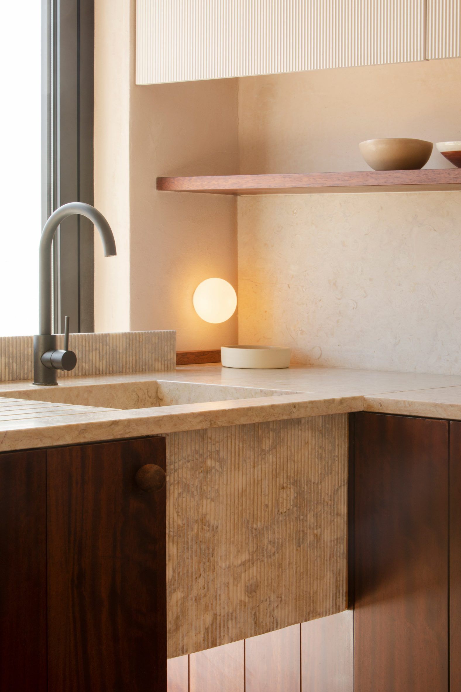
In the kitchen, the studio added an L-shaped kitchen counter made from marble.
“We used Lioz marble, a type of stone extracted locally that has been used in kitchen counters for centuries due to its hard and extremely resistant surface,” Gameiro said. “We also loved how it resonated with the sandy and terracotta hues of the hills nearby.”
The apartment features an unusual bathroom, organised around a shower base that was designed to have an organic shape reminiscent of “shapes found on the beach”, the studio said.
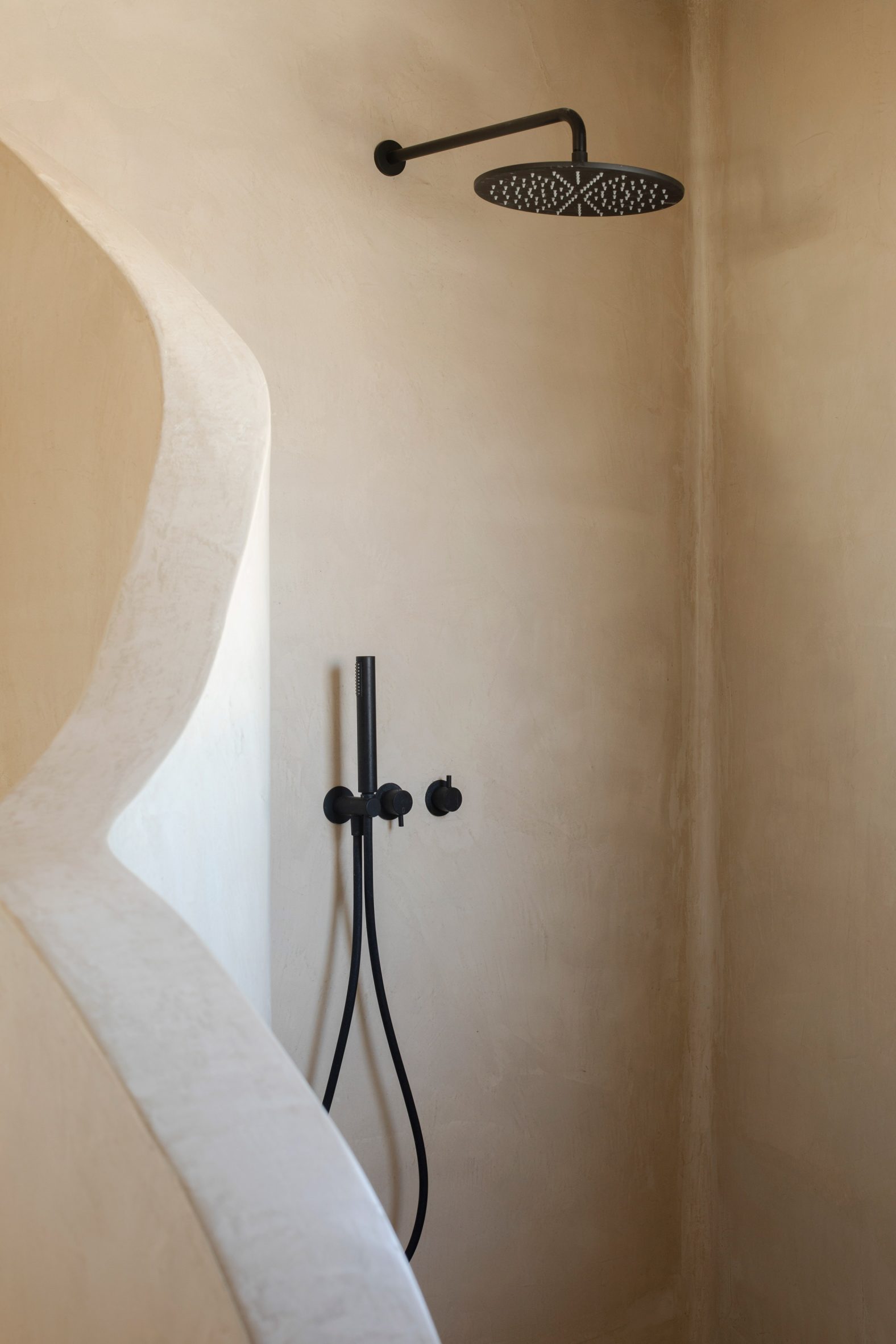
It was made from Moleanos stone – a type of Portuguese limestone set with the remains of sea shells – and was inspired by the coastal erosion that has affected the area.
“As in most of these coastal formations, it has previously suffered from erosion, which in this case was eventually stopped by the pro-active planting of the Caparica pine forest,” Gameiro said.
“This is now considered a natural protected area and what is left is a coastal outline of ins and outs to and from the beach, which inspired the organic shape of the shower wall.”
In the study, the studio added a bespoke desk and wooden shelving, while the bedroom has a custom-made make-up desk and a bespoke wooden bed.
Other recent Portuguese interior design projects featured on Dezeen include a Lisbon home by Fala Atelier and a boutique hotel by designer Christian Louboutin.
The photography is by Tiago Casanova.
The post Studio Gameiro draws on hues of Caparica cliffs for Arriba apartment appeared first on Dezeen.

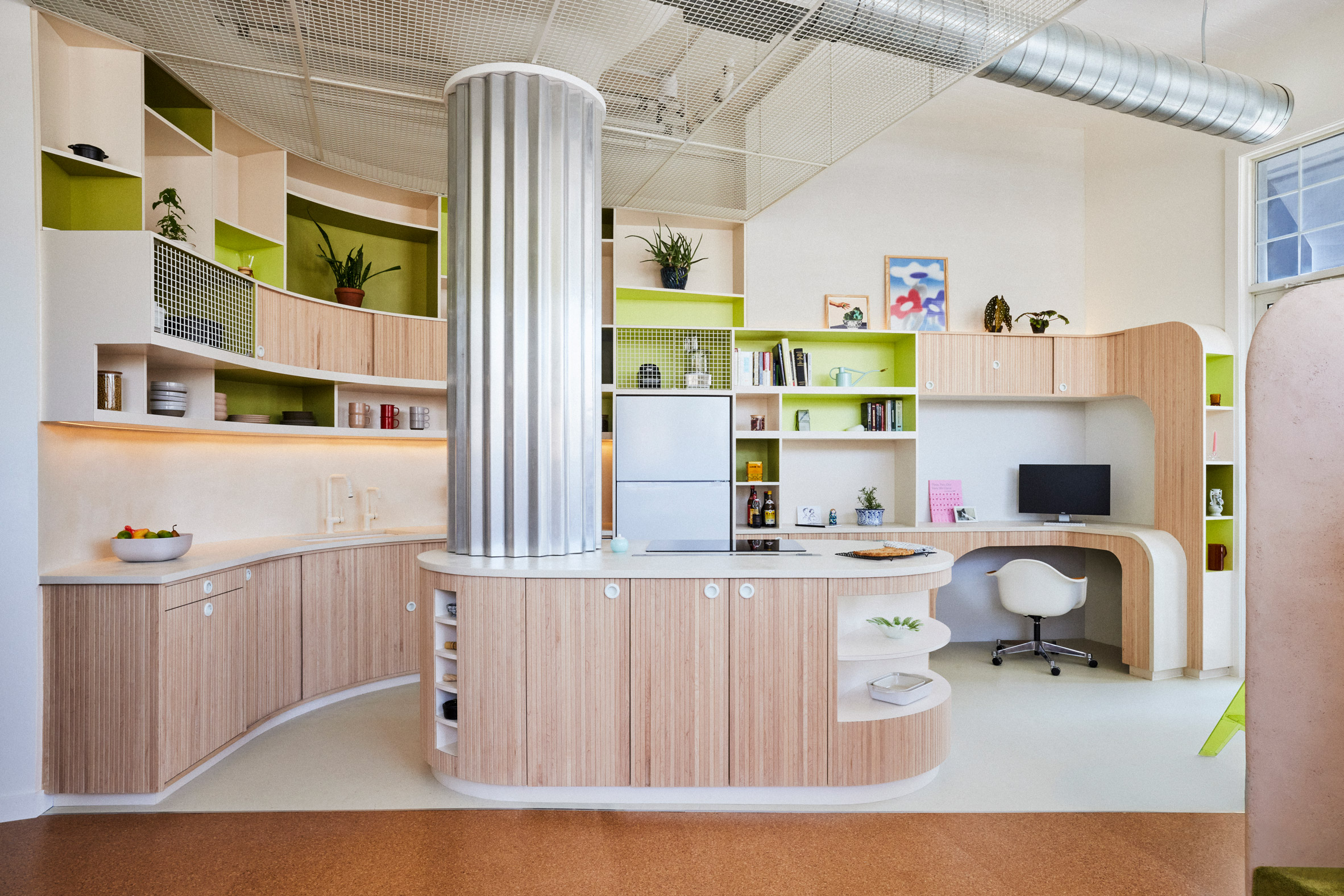
Brooklyn practice Almost Studio has completed an apartment renovation inside a former chocolate factory, retaining an open layout while adding level changes to demarcate functional spaces.
The Loft for a Chocolatier occupies part of a 1947 industrial building along Myrtle Avenue, in the Bedford-Stuyvesant neighborhood of Brooklyn.
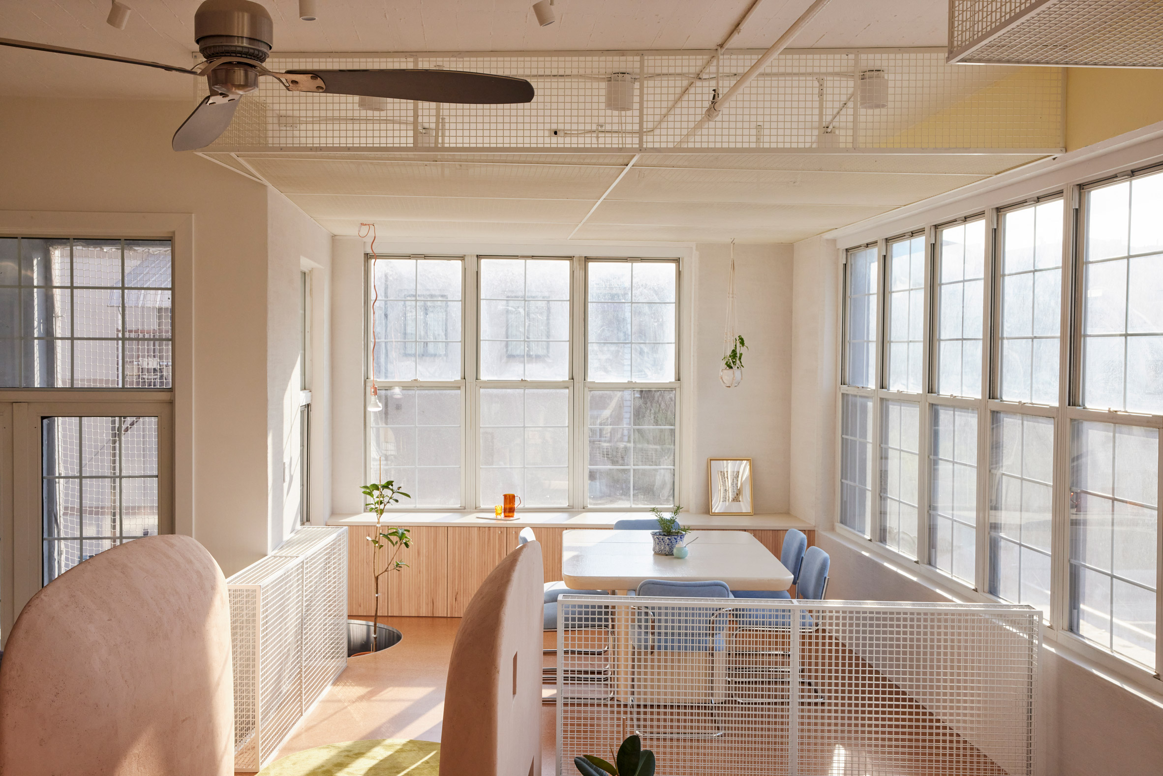
The apartment boasts many features typical of loft-style living, including high ceilings, large windows, and exposed pipes and ductwork.
In one sense, Almost Studio founders Anthony Gagliardi and Dorian Booth aimed to retain this character through an open floor plan, adding powder-coated white mesh boxes and metallic accents.

In another, the pair chose to denote or separate some of the functional areas using changes in angle or elevation.
They looked to artists like Kazimir Malevich and Josef Albers for ways to honour the original spatial composition while organising the various spaces.

“It became a way for us to distinguish different areas – such as entry, kitchen, living room, dining room, and office – through these subtle rotational moves in a space that was otherwise entirely open,” said Gagliardi and Booth.
“In many lofts, every space is equally capable of hosting any activity, and is therefore equally inadequate to host any activity,” the duo continued. “If a dining room can also be an office, gym, and workshop – is it the best place to have dinner?”

The apartment’s dining room is therefore located on a raised platform at the end of the space, where the ceiling is also lowered using the mesh boxes.
This set-up aims to create “a closer relationship with the high loft windows, and light, as well as a smaller, more intimate space for conversations”, Gagliardi and Booth said.
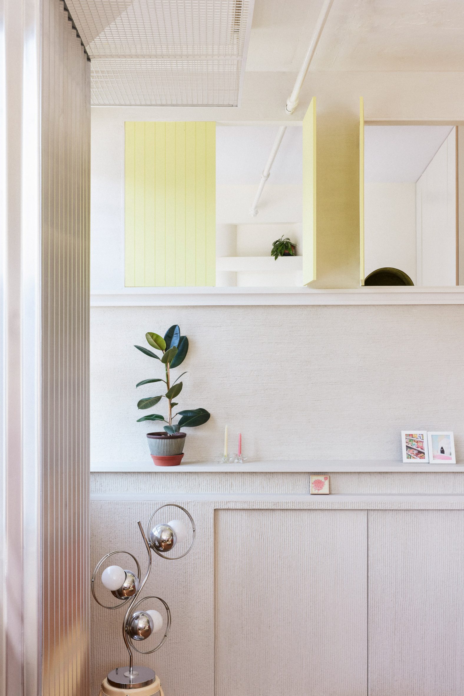
The raised area is accessed via a short staircase that’s covered in green carpet and flanked by sculptural pale pink screens.
These elements – covered in Shirasu Kabe plaster – are indicative of the studio’s approach to softening the industrial architecture, along with cork flooring and wainscoting, and upholstered seating.
Pale millwork fronts the pill-shaped kitchen island and curved cabinets behind, while other niches are left open and lined in chartreuse.
The kitchen counter integrates an area for a desk, used as a home office, where the shelving also continues overhead.
Meanwhile, corrugated metal surrounds a structural column that anchors the island, and the dining chairs have tubular steel frames.
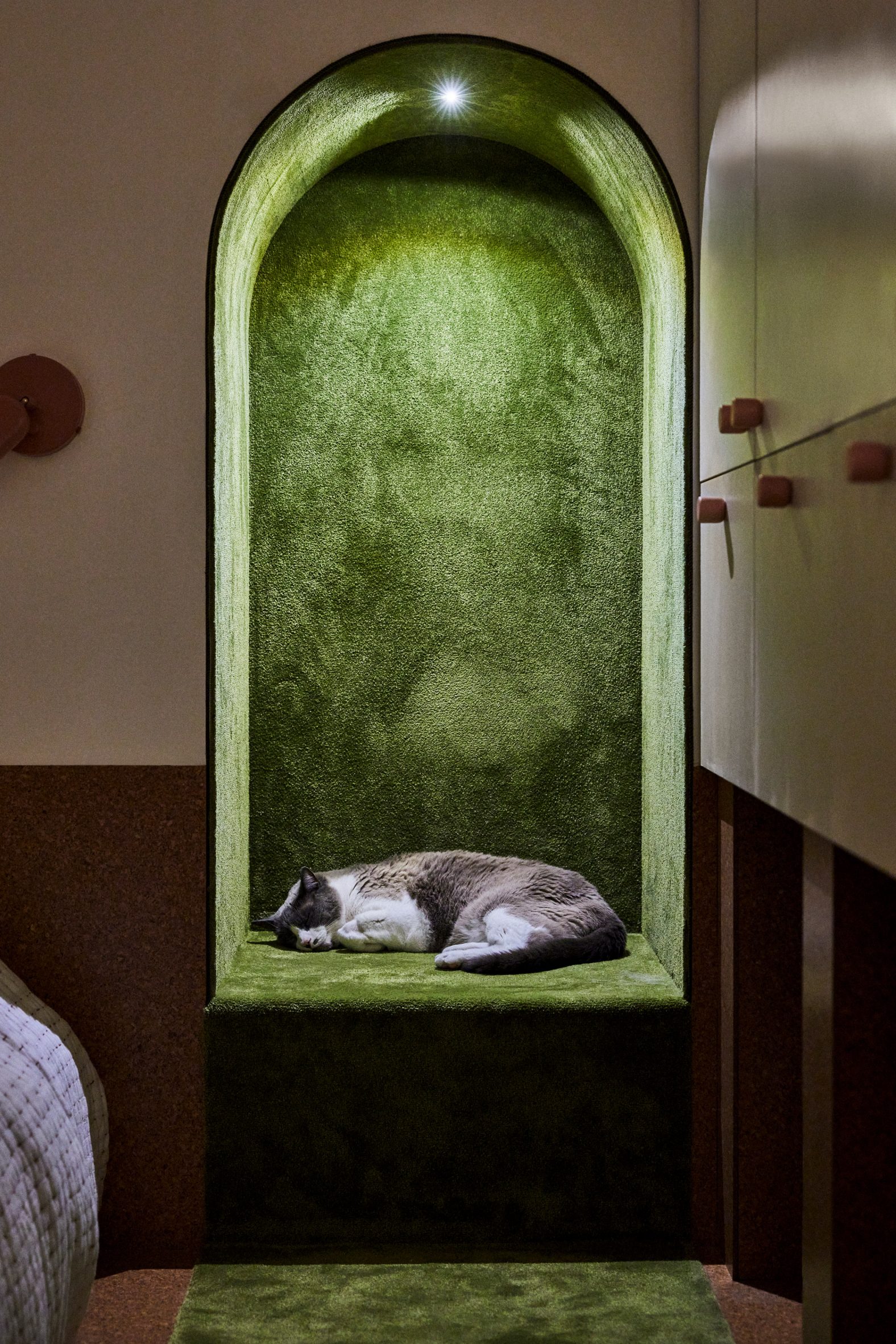
At the opposite end from the dining room, another elevated portion of the space houses a bedroom, which is closed off from the rest of the apartment.
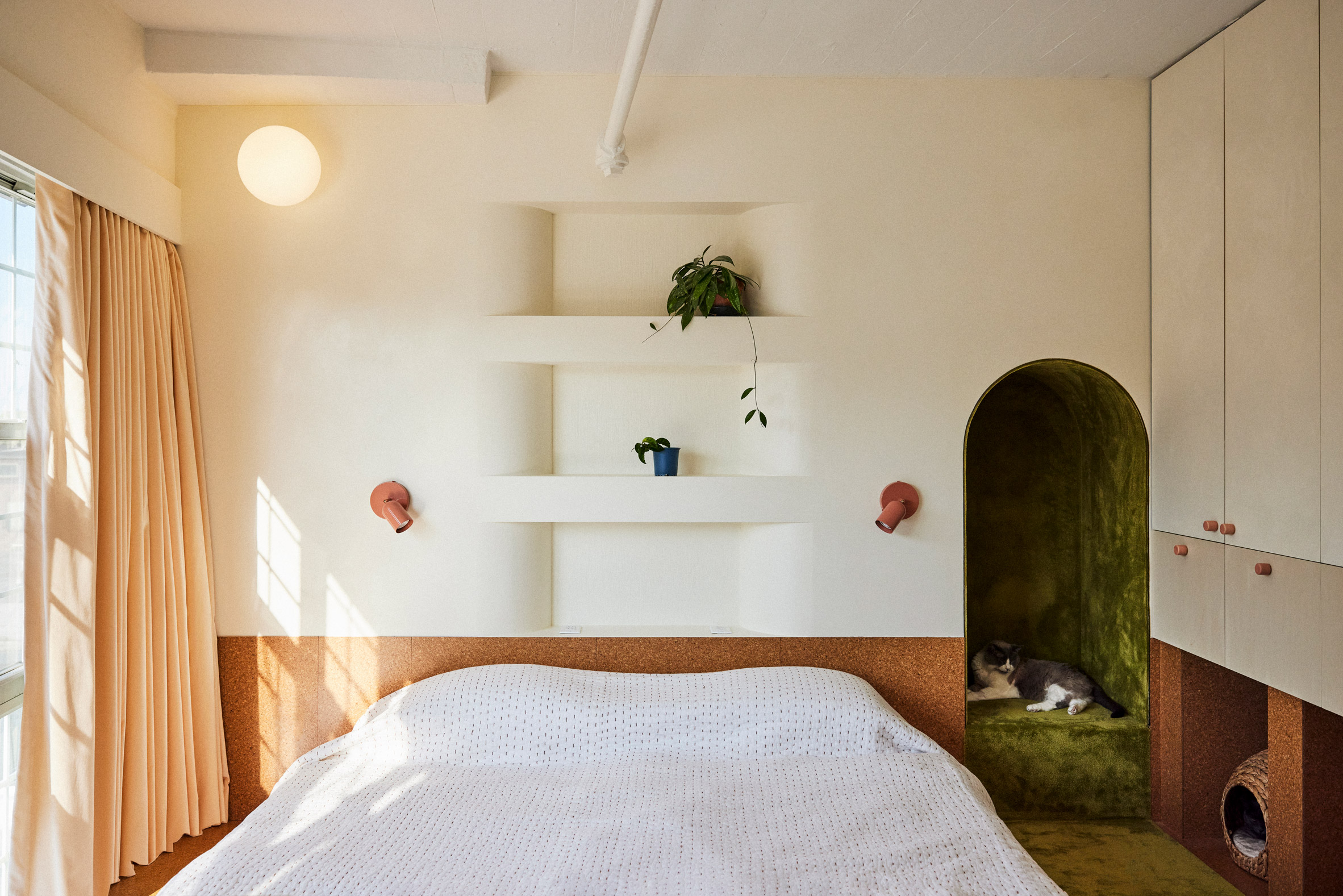
This space is more intimate, and features cream walls, built-in storage, and an arched niche beside the bed that’s lined with more green carpet for the owner’s cats to nap in.
A fritted glass door slides across for privacy, and a series of shutters that offer views between the bedroom and the main living area can be closed when desired.
Brooklyn has many former industrial buildings that have been converted for residential use over the past decade.
Others include a 19th-century hat factory in Williamsburg that is now home to an apartment that doubles as a performance space and a warehouse in Dumbo where one loft features a book-filled mezzanine.
The photography is by Jonathan Hokklo.
The post Almost Studio designs Loft for a Chocolatier in Brooklyn appeared first on Dezeen.