26 Apr, 2024 | Admin | No Comments
CitizenM aims for “differentiation through massing” at Downtown Austin location

Architecture studio Concrete has designed a hotel block for Dutch chain CitizenM in Downtown Austin, which is the brand’s first Texas location and features artwork created in partnership with locals.
CitizenM worked with long-time collaborator architecture studio Concrete to purpose-build a 16-storey structure at the top of a slope in the city’s downtown.

Working with US architecture studio Baskervill to create the symmetric facade, which features wide spans of black steel interspersed with wide windows, with a stretch of aluminium panelling above the entrance.
The brand said that the modern form was meant to stand out from the surrounding buildings – a mix of historical stone buildings and contemporary glass-clad skyscrapers.
“Downtown Austin is quite a dynamic urban environment with many new constructions gradually changing the character of this part of the city,” CitizenM told Dezeen.
“We are surrounded by lower, older buildings as well as some of the new office towers. While CitizenM is standing out as one of the new additions to the neighborhood we try to add character and interest to our buildings by creating differentiation through massing, materials and facade design.”

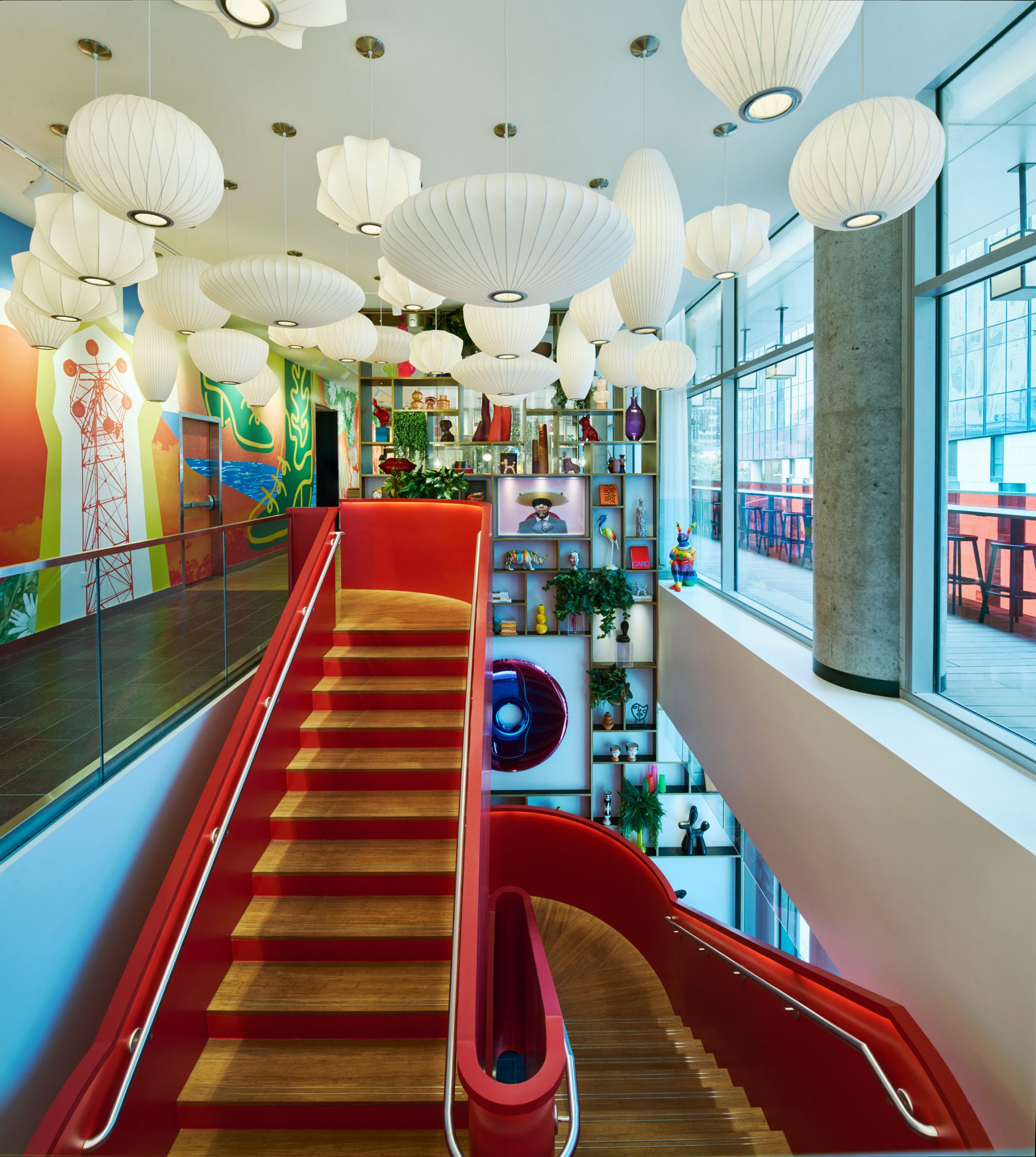
The double-height entrance space features a floor-to-ceiling glass wall that wraps the corner of the block. It has been set back from the street with an overhang created by a cantilever on the lobby level.
CitizenM placed its signature red staircase at the entrance. It leads up to the lobby floor past built-in shelving cluttered with Pop Art pieces, many of which were gathered from local artists and sources.
The eclectic collection of art continues in the lobby and the 344 guest rooms, which have works selected with the help of Austin Contemporary Museum.

The lobby was divided into a variety of spaces separated by built-in shelving and furnished with brightly coloured editions of modern furniture, most of which was supplied by Vitra.
The bar and social area feature banquette seating placed under the glass walls.
In the hallways of the upper floors, the mix of standardisation and localisation continues. Red carpets have been printed with the black outline of an aerial view of the Austin city grid.
Each room has a large king bed wedged under a window with blinds remote-controlled from a bedside iPad, which also controls the lights. A wrapped polycarbonate pane separates the shower from the rest of the room and a small sink sits opposite.

Amenities include a workout room that includes an AI fitness instructor that operates through video feedback and a rooftop pool adorned with a mural by Mexican artist Hilda Palafox.
CitizenM was founded to give contemporary travellers a sense of “affordable luxury”, according to the brand, and has recently opened in Miami.
The photography is courtesy of CitizenM.
The post CitizenM aims for "differentiation through massing" at Downtown Austin location appeared first on Dezeen.
26 Apr, 2024 | Admin | No Comments
Christian de Portzamparc wraps Dior flagship store with “resin shells” in Geneva

Six interweaving “petals” encase the facade of Dior‘s store in Geneva, Switzerland, which has been designed by Pritzker Architecture Prize-winner Christian de Portzamparc.
The Dior store’s expressive facade elements echo those of its Seoul flagship store – also designed by French architect De Portzamparc – that similarly draws on fabrics used for Dior’s creations.

“The voids between the petal-shaped shells let in natural light and sculpt the space,” De Portzamparc told Dezeen.
“This circulation of light creates a dialogue between inside and outside,” he added. “At night, the flagship becomes a great urban lantern, with interior lighting filtered through the petals.”
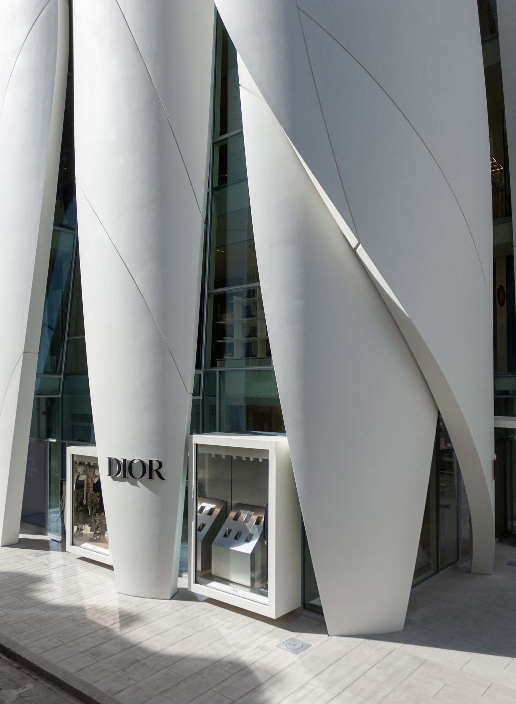
The facade elements rise up from the building’s base widening at their centres before tapering towards the building’s roof.
Behind them, floor to ceiling openings wrap around the building – revealing the building’s six floors and providing views into the interiors. Additionally, a series of display cases decorate the facade at street level.
Inside, the spaces were finished with neutral-toned surfaces and wood panelling, which is set off by the colours and patterns of Dior’s spring-summer 2024 collection.
Built in display cases fitted with sleek shelves and glass cabinets line the interior spaces and are illuminated by gallery-style lighting fixtures.
Plush seating decorates the boutique’s interior and is coupled with consoles made by Berlin-based Stefan Leo Atelier and tables by Anglo-Brazilian designer Hamrei.
“The boutique offers a contrast worthy of European Baroque, with a pure, rounded exterior and an interior of quasi-artistic profusion,” De Portzamparc said.
“The aim was to bring as much natural light as possible to the interior of the boutique, but also a certain light to the city of Geneva.”

De Portzamparc was awarded the Pritzker Prize in 1994 and became the first French architect to receive the prestigious architecture award.
Other recently completed flagship stores include a marble “immersive experience” for APL’s flagship store in New York City and Huawei’s store in Shanghai with a “petal-like” facade.
Other fashion brand stores that have recently opened include a “sensual” boutique in Milan designed by Vincent Van Duysen for fashion house Ferragamo and a boutique decorated with hand-painted murals by Cúpla for fashion brand Rixo in central London.
The photography is by Jonathan Taylor unless otherwise stated.
The post Christian de Portzamparc wraps Dior flagship store with "resin shells" in Geneva appeared first on Dezeen.
23 Apr, 2024 | Admin | No Comments
“I think my work stands out because I follow my gut” says Kelly Wearstler

Kelly Wearstler is often hailed as contemporary interior design‘s most recognisable name. In this interview, she tells Dezeen about crafting her textured and eclectic style.
American interior designer Wearstler has been dressing rooms since her mid-twenties, rising to become one of the discipline’s most significant names.
“I’m obsessed with nuance,” she told Dezeen. “I view design as boundless and undefined, but if I had to choose a single word to describe my approach it would be ‘mixology’.”

High-end interior design has been dominated by minimalism and sleekness in recent years, but Wearstler’s projects are known for their eclectic grandeur.
Her studio is responsible for the interiors at a slew of luxury hotels, including four locations across North America for the Proper Hotel Group.
For example, she created an Austin branch with a sculptural oak staircase that doubles as a ziggurat of plinths for individual ceramic pots. Meanwhile, The Downtown LA Proper features 136 unique types of vintage or custom-made tile.
“Luxury is more of a feeling than a specific quality”
“To me, luxury is more of a feeling than a specific, tangible quality,” Wearstler said. “It’s all about texture and sensation, but also storytelling and considered curation.”
“The most luxurious spaces bring together unique objects that each have their own history, essence and character, and encourage an elegant conversation between them,” she added.
“A technique I always like to use when pursuing a sense of luxury is mixing vintage and antique items with more contemporary pieces. The history and character that come with vintage furniture help to create a ‘luxurious’ experience.”
This approach is also reflected in Wearstler’s residential and retail projects, which she tends to fill with unlikely combinations of pieces – a habit she traces back to visiting antique shows and auctions with her mother, who was an antique dealer, as a young girl.

Among these projects is the designer’s own 1950s beachfront cottage in Malibu, California, furnished with objects chosen to be “hand-crafted, rustic and raw”.
Wearstler also replaced the home’s existing shag carpet with seagrass as a nod to the surrounding coastal setting.
“My design philosophy is rooted in a firm commitment to juxtaposition and contrast, whether this be in relation to textures and colourways, materials or even eras in time,” said Wearstler.
“For me, contrast is what brings a sense of soul to a space. It creates interest, lets the space take on a life of its own and imbues it with a feeling of genuine authenticity.”
“AI has exponentially enriched our creative process”
Wearstler says her design philosophy was partly shaped by working in the film industry early on in her career.
Before forming her eponymous studio in California in 1995, she worked in various roles including set decoration and art direction – an experience she claims shaped her appreciation of the “emotion and atmosphere” of a space.
“My time working as a set designer definitely impacted my approach to interior design,” Wearstler told Dezeen.
“Working on film sets taught me the importance of dramatic intent, and that’s remained a key element of my work throughout my career.”
Despite her penchant for vintage pieces, Wearstler stressed the importance of rising to contemporary challenges – not least artificial intelligence (AI) and its impact on design.
Wearstler’s studio has been using generative AI – which she calls an “ally” – since 2021, citing image-generating platforms including DALL-E and Midjourney as tools to generate ideas.
The same year, the designer created a virtual garage, playfully imagined as a home for basketball player LeBron James’s electric Hummer, decked out with renderings of Wearstler-designed furniture including the studio’s Echo bench and Monolith side table.
“Many people see the introduction of AI as a challenge, but I think of it as one of the greatest tools for growth,” said Wearstler. “AI has exponentially enriched our creative process.”
“As designers, it’s our responsibility to push the boundaries of our craft and to create spaces that elegantly and artistically reflect the world around us,” she added. “AI is a vital tool in allowing us to do this in new and extraordinary ways.”

Wearstler has published six books and with 2.2 million Instagram followers, she is often considered interior design’s most recognisable name.
“I think my work stands out because I follow my gut,” she reflected. “Whether I’m designing a hotel, a private residence or a product, I give its emotional and physical attributes equal consideration.”
“Most importantly, I strive to bring my clients and customers joy through my designs. I’m not sure if that’s what makes me the ‘most recognisable name’, but if you design with the person who will be living in a space, or with a light fixture or chair, in mind, your work will resonate.”
Dezeen In Depth
If you enjoy reading Dezeen’s interviews, opinions and features, subscribe to Dezeen In Depth. Sent on the last Friday of each month, this newsletter provides a single place to read about the design and architecture stories behind the headlines.
The post "I think my work stands out because I follow my gut" says Kelly Wearstler appeared first on Dezeen.
22 Apr, 2024 | Admin | No Comments
There's still time to feature in Dezeen's digital guide to NYCxDesign 2024

There’s still time to get listed in Dezeen Events Guide‘s digital guide to the 12th anniversary of NYCxDesign, the annual festival located in New York City.
Running this year from 16 to 23 May 2024 across Brooklyn, Queens and Manhattan, the festival hosts an eight-day programme of talks, exhibitions, installations, open studios, product launches and tours.
Among the events are International Contemporary Furniture Fair (ICFF) and WantedDesign Manhattan, which take place from 19 to 21 May 2024 at the Javits Center.
The interdisciplinary festival explores a range of mediums, including design, fashion, textiles, architecture, art and photography.
Get listed in Dezeen’s digital NYCxDesign guide
Get in touch with the Dezeen Events Guide team at eventsguide@dezeen.com to book your listing or to discuss a wider partnership with Dezeen.
There are three types of listing available:
Standard listings cost £125 ($160) and include the event name, date and location details plus a website link. These listings will feature up to 50 words of text about the event.
Enhanced listings cost £175 ($225) and include all of the above plus an image at the top of the listing’s page and a preview image on the Dezeen Events Guide homepage. These listings will also feature up to 100 words of text about the event.
Featured listings cost £350 ($450) and include the elements of an enhanced listing plus a post on Dezeen’s Threads channel, inclusion in the featured events carousel on the right hand of the homepage for up to two weeks and 150 words of text about the event. This text can include commercial information such as ticket prices and offers and can feature additional links to website pages such as ticket sales and newsletter signups.
For more details about partnering with us to help amplify your event, contact the team at eventsguide@dezeen.com.
About Dezeen Events Guide
Dezeen Events Guide is our guide to the best architecture and design events taking place across the world each year.
The guide is updated weekly and includes events, conferences, trade fairs, major exhibitions and design weeks.
The illustration is by Justyna Green.
The post There's still time to feature in Dezeen's digital guide to NYCxDesign 2024 appeared first on Dezeen.
22 Apr, 2024 | Admin | No Comments
Woods Bagot designs art deco-informed restaurant at Rockefeller Center

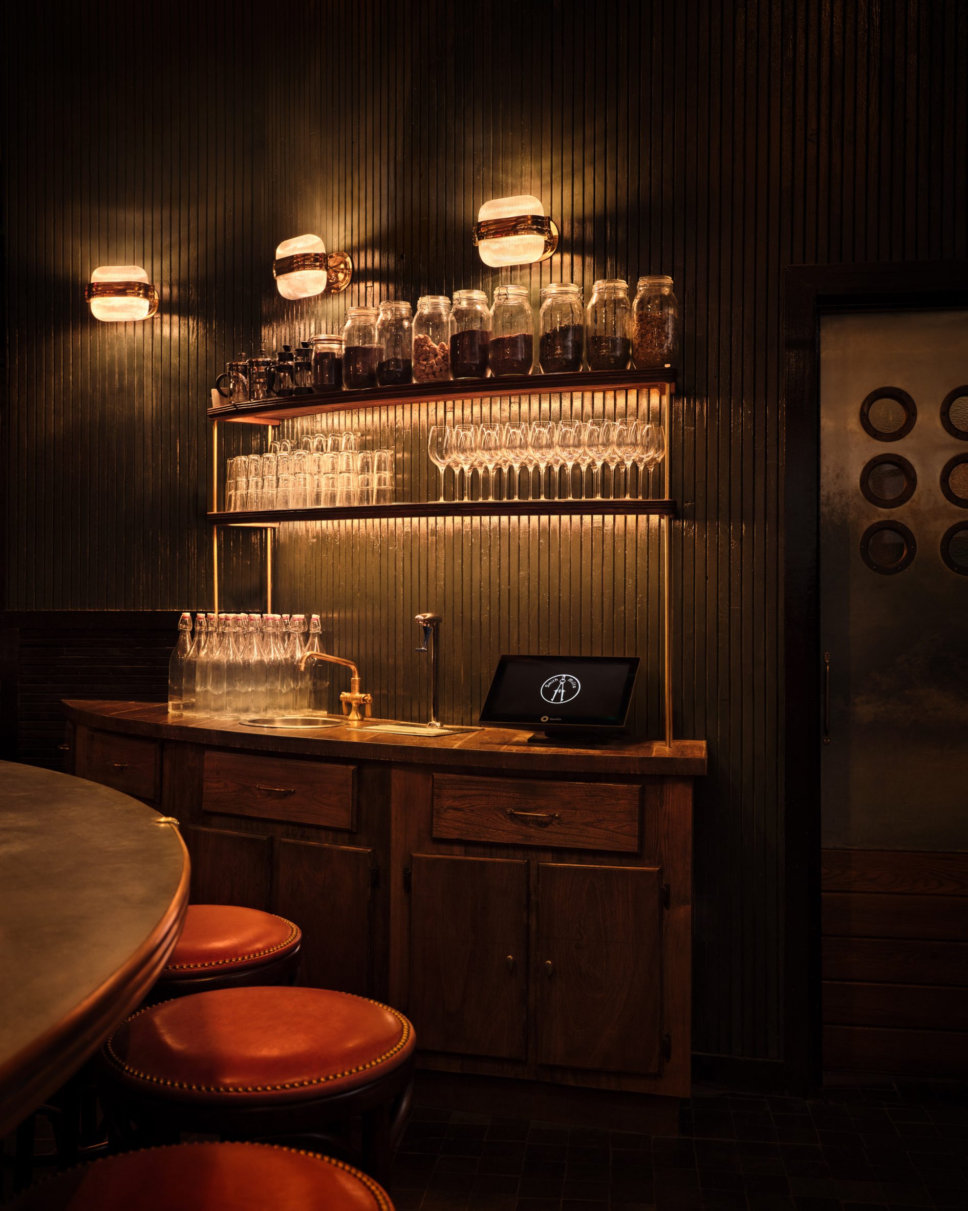
Dim lighting and dark tones define the interiors of the second Smith & Mills restaurant in New York, recently completed by architecture studio Woods Bagot.
Situated in New York’s Rockefeller Center, the restaurant’s interiors were designed by Woods Bagot in collaboration with New York City-based hospitality management consultancy Neighborhood Projects.
To enter the space, guests walk through a snug hallway covered with vintage elevator-cab panels.

“It was very important to us that we created a transition zone off the concourse before you enter the main dining room,” explained Wood Bagot’s Krista Ninivaggi.
“This would act as a buffer to feel the buzz of the heart of Rock Center diminish, and then be enveloped in our warm amber glow.”
“We achieved this by using old wrought iron elevator cab screens to partition off the entry and lowering the ceiling for a classic design move of compression before being ‘released’ into the carefully crafted atmosphere of the restaurant,” she continued.

Columns clad in zellige tiles and mirrors divide the space, while antique-style mirrors on the walls and reclaimed wood panelling were used to create a vintage feel in the restaurant, which is the second Smith & Mills to open in the city.
“We used the reclaimed panelling and zellige tile to ‘paint’ all of the wall surfaces,” Ninivaggi explained. “We alternated them in key locations by deciding what should feel ‘warm’ with the wood or ‘hard’ with the tile.”
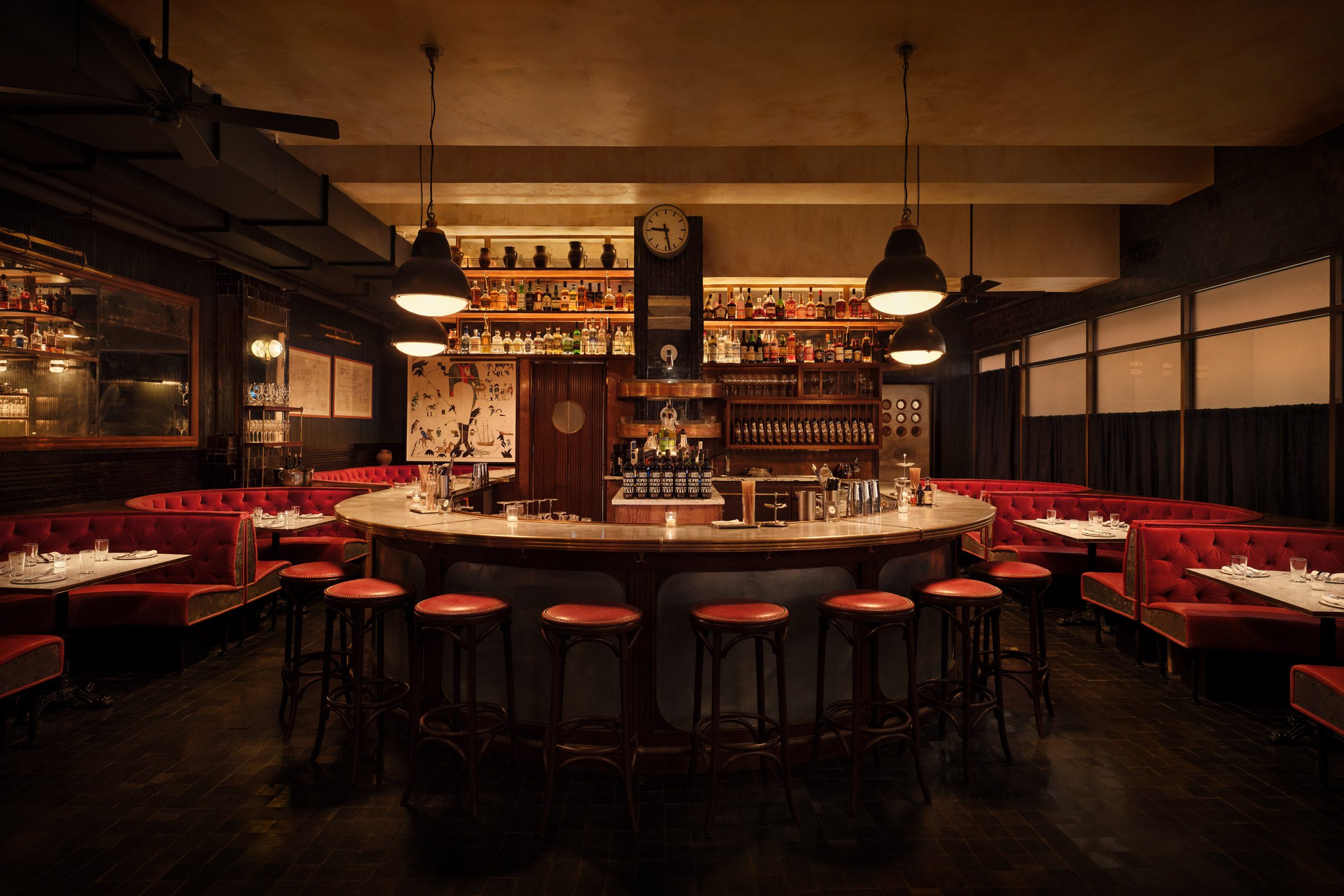
An oval bar made of zinc and walnut, which sits on a tiled black stone floor, functions as the restaurant’s focal point.
In the dining area, the studio chose banquette seating dressed in oxblood velvet in a nod to the restaurant’s original location in New York’s Tribeca neighbourhood. Marble tables with brass accents and bistro chairs complement the design.

The interior of the restaurant’s private dining room features a transition from handmade red zellige tiles sourced from Morocco on one wall to a botanical print wall covering above.
Lighting fixtures, such as pendants and sconces, cast ambient lighting throughout the space. Artwork by Ukrainian artist Yelena Yemchuk hangs on the walls.
“The lighting was very carefully considered both in its design and light quality, to give the appropriate hue to the space,” Neighborhood Projects’ Matt Abramcyk told Dezeen.
“We went so far as to undertake tests to find the right vinyl to veil the light from the concourse to give a warm backdrop,” he continued.
The location of the new restaurant also had a big influence on the design.
“At both locations, Smith & Mills strives for simple, rustic design, with materials that nod to the past,” Abramcyk concluded. “Because of the new location’s iconic surroundings, the Rockefeller Center design also nods to art deco, in particular.”
Other restaurant interiors recently featured on Dezeeen include a Korean fried chicken restaurant in New York designed by Rockwell Group and a cocktail lounge in Las Vegas created by musician Bruno Mars in collaboration with design studio Yabu Pushelberg.
The post Woods Bagot designs art deco-informed restaurant at Rockefeller Center appeared first on Dezeen.
22 Apr, 2024 | Admin | No Comments
Panter & Tourron and Davide Rapp create “speakeasy-style secret lounge” in Milan

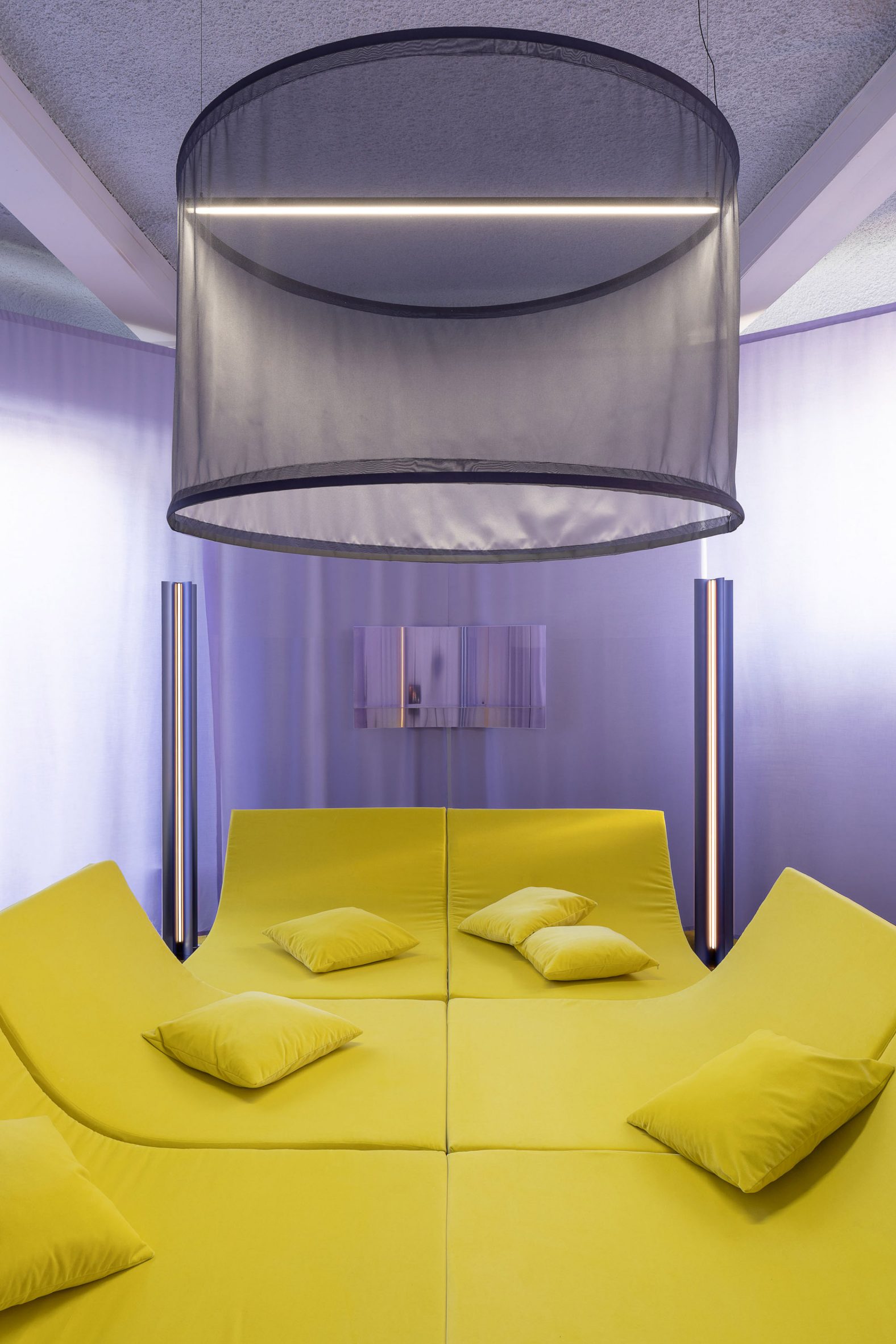
Experimental furniture and nostalgic films combine in Diurno, a Milan design week installation exploring the past and future of the living room.
Curated by Gianmaria Sforza, the show features the work of Lausanne-based design studio Panter & Tourron and Italian video artist Davide Rapp.

It saw a Milanese studio apartment transformed into a “speakeasy-style secret lounge” where a limited number of guests were invited into an octagonal room surrounded by purple curtains.
Once they had swapped their shoes for slippers, guests were encouraged to get comfortable on a yellow sofa-bed hybrid. Here, they could chat to other guests, enjoy a drink and watch the montage-style videos playing around them.
Rapp produced three videos, with hundreds of clips that show living room interiors depicted primarily in Italian cinema.
Each film focuses on a different piece of furniture. The sofa, the television and the bar are all featured.
“Diurno is an invitation to take a break from the hustle and bustle of Milan’s design week, a speakeasy-style secret lounge where guests can relax in a setup that oscillates between nostalgia and science fiction,” said the design team.
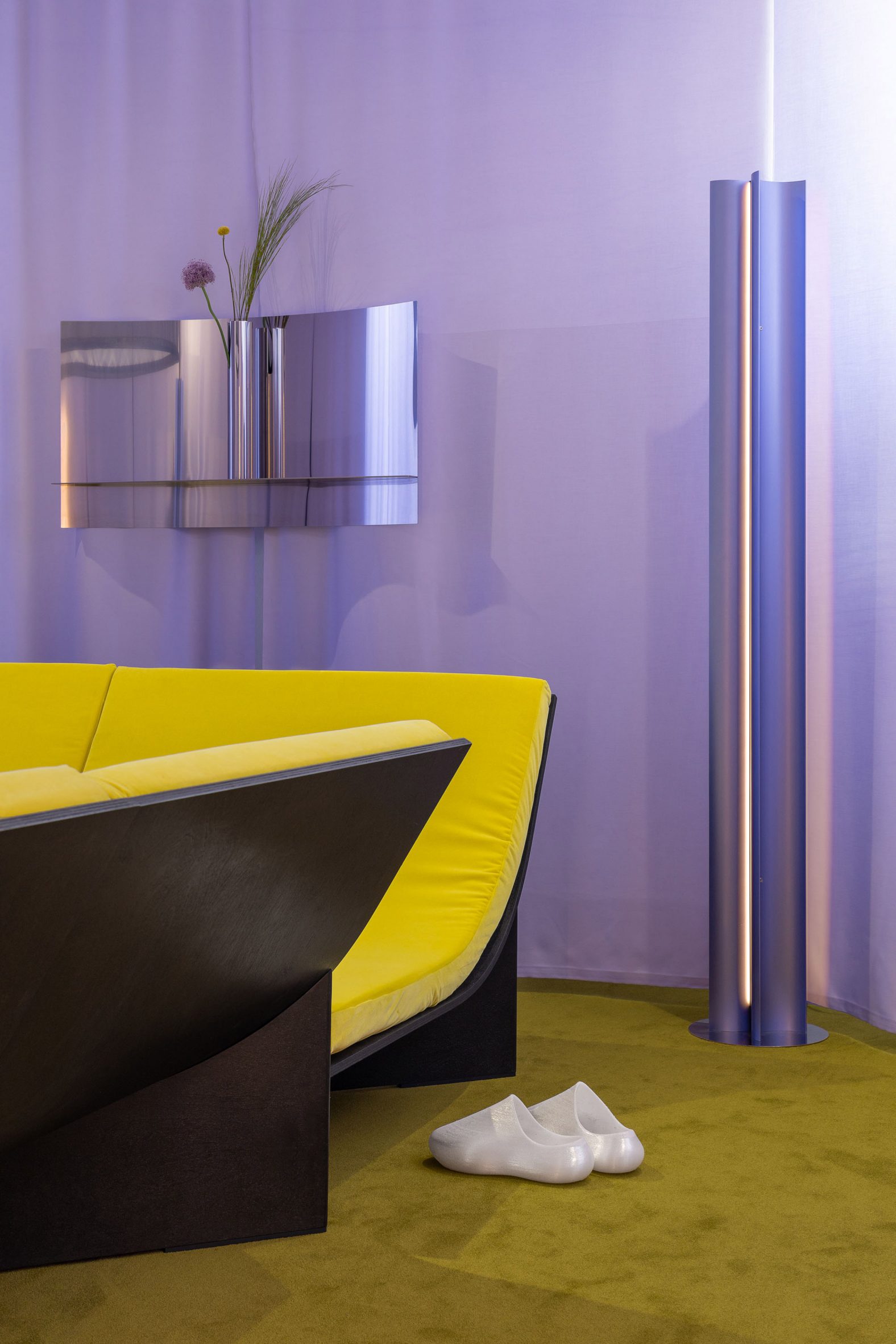
Panter & Tourron founders Stefano Panterotto and Alexis Tourron developed six pieces of original furniture for the space.
As well as the modular sofa platform, the Hall collection includes a lightweight chandelier, a tubular floor lamp, mirrored stools, a curved display shelf and slender vases.

The duo hoped to draw attention to the changing nature of lounge and passage spaces in the home.
The project has an affinity with another of their recent works, Couch in an Envelope, which imagines a sofa that can be folded up and carried from place to place.
“Looking at the decors from gathering spaces like entrance halls, lobbies and lounge rooms, the pieces in the collection function like a reenactment element, questioning the evolution of these places today and our relationship to shared environments at large,” they said.
Drinks and snacks were served on matching mirrored trays, on linen cocktail coasters embroidered with the Diurno brand logo. These were produced in collaboration with La Colombarola.
Danish textile brand Kvadrat, Italian steel manufacturer Fittinox and material supplier Formtech also donated materials to make the event possible.
View this post on Instagram
One of the videos featured movie clips of scenes that centred around a sofa
This isn’t the first takeover of this apartment. Under the name Studio di Pittura, it is primarily an art space with the goal of facilitating collaboration between international and local creatives.
Diurno was one of Dezeen’s pick of the 12 key installations on show for Milan design week.
The photography is by Giulio Boem.
Diurno was open by appointment only from 13 to 20 April. See Dezeen Events Guide to discover our Milan design week guide, or for more architecture and design events taking place around the world.
The post Panter & Tourron and Davide Rapp create "speakeasy-style secret lounge" in Milan appeared first on Dezeen.

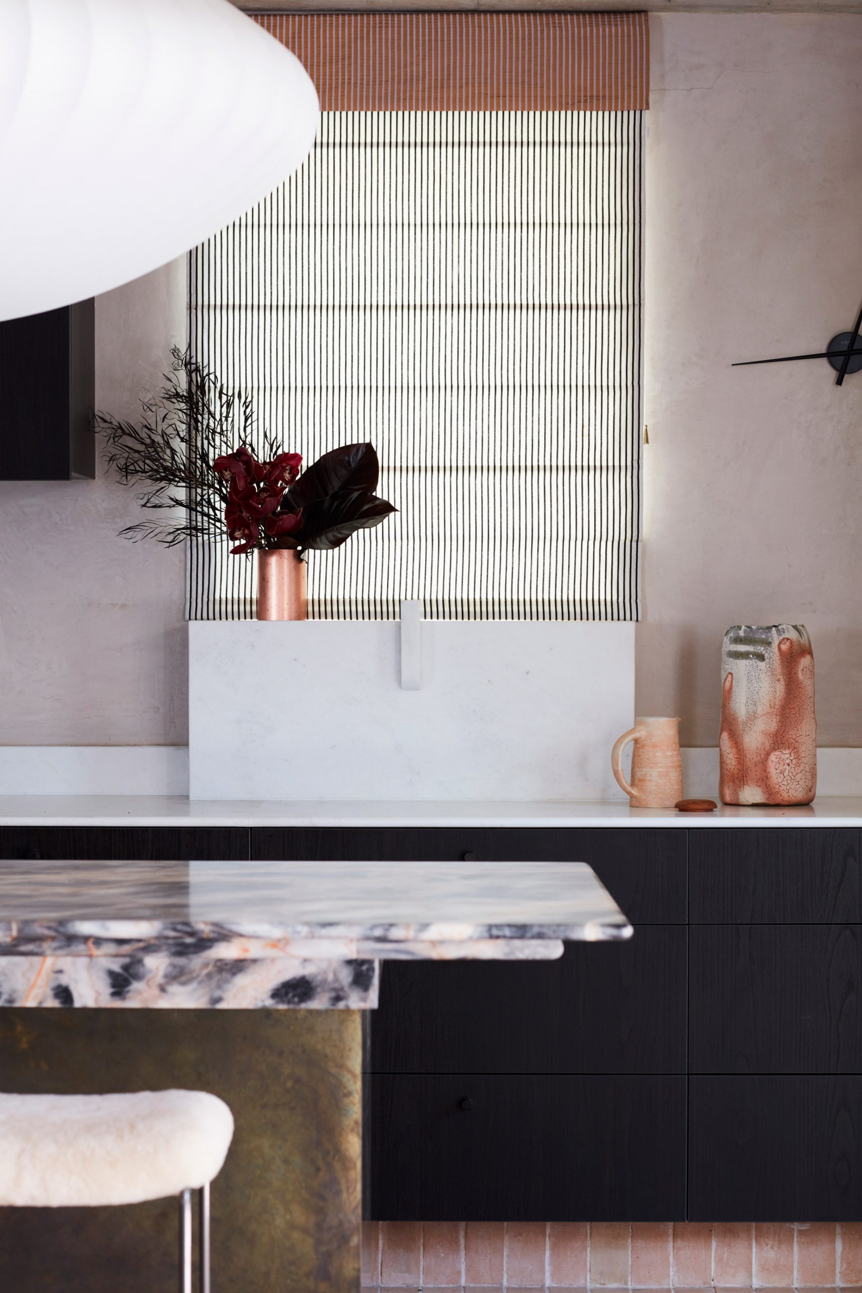
Shades of green, red and yellow run throughout this lookbook, which collects nine home interiors enlivened by colourful window frames.
Whether painted wood, plastic or metal, opting for colourful window frames is an easy way to brighten a residential interior.
The examples in this lookbook demonstrate how they can be used to create a focal point in a pared-back space, draw attention to a view or simply help establish a colour theme.
This is the latest in our lookbooks series, which provides visual inspiration from Dezeen’s archive. For more inspiration, see previous lookbooks featuring organic modern interiors, eclectic hotels and flooring that enhances the connection between indoors and outdoors.
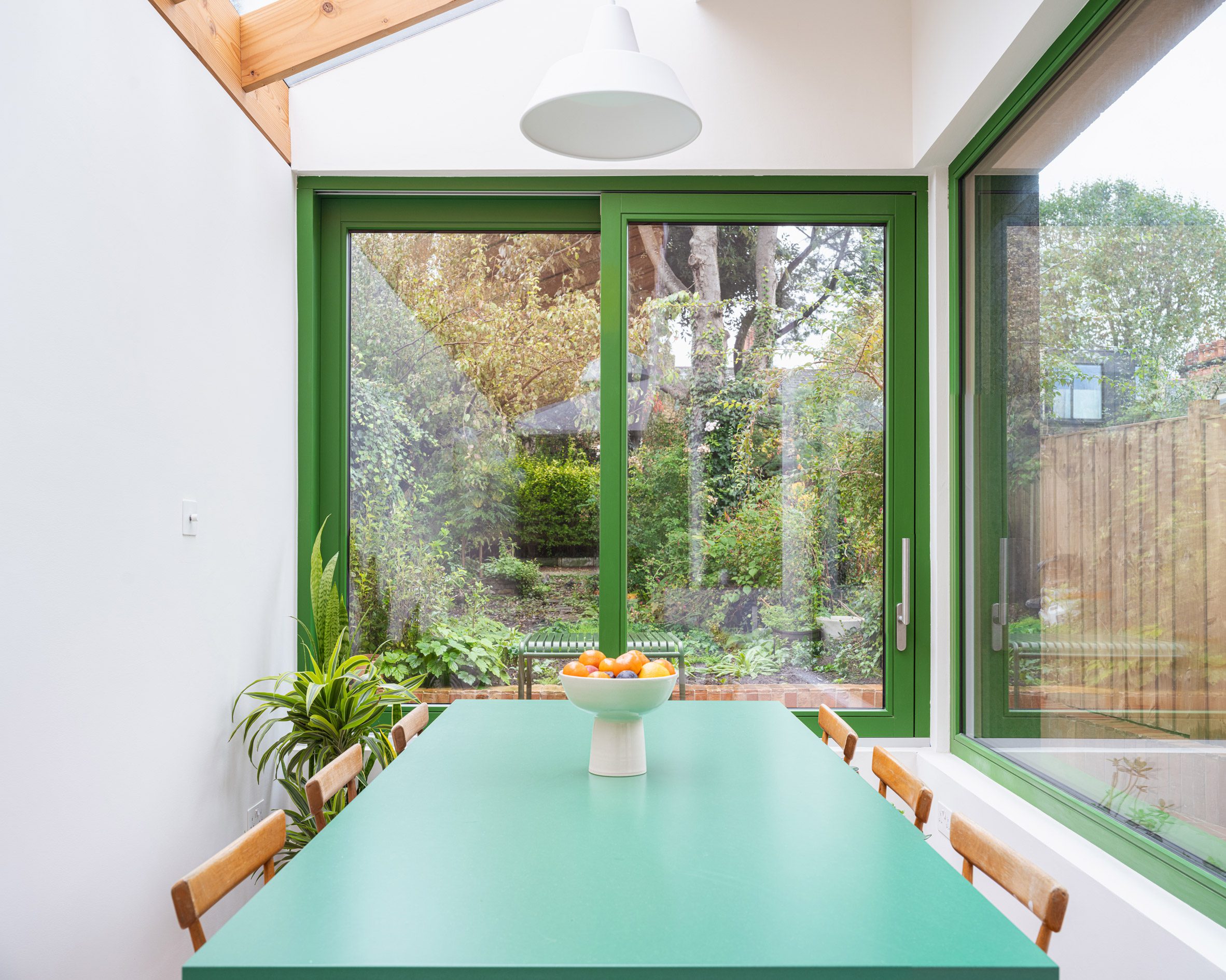
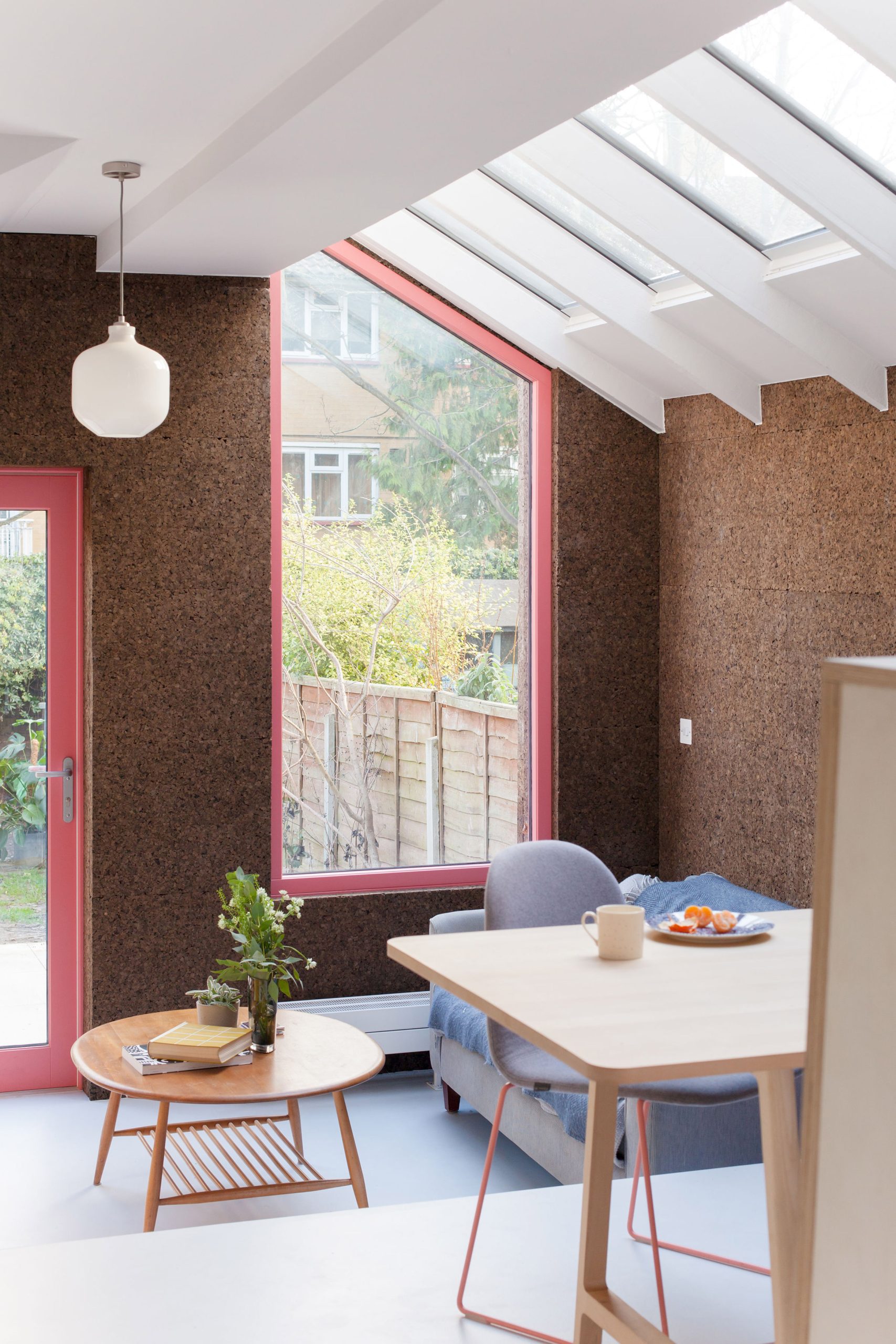
Camberwell Cork House, UK, by Delve Architects
A bright forest green paint lines the window frames at Camberwell Cork House, helping to draw focus to the lush planting outside.
The paint juxtaposes the deliberately simple, white-walled interiors of the house extension, while outside it pops from against walls of tactile cork cladding.
Find out more about Camberwell Cork House ›

House 669, Sweden, by HelgessonGonzaga Arkitekter
HelgessonGonzaga Arkitekter incorporated sunny yellow frames throughout House 669, a prefabricated home it created in Stockholm.
The irregularly placed windows help enliven the otherwise neutral finishes to the home while adding a sense of “individuality” to its uniform structure, the studio said.
Find out more about House 669 ›
Cork House, UK, by Nimtim Architects
Another studio to have married bright window frames with cork cladding is Nimtim Architects. At this extension in London, the studio punctured the cork-lined walls with Barbie pink timber frames, offering a contemporary counterpoint to the Victorian house to which it is attached.
The windows are complemented by more subtle pops of pink inside, including the kitchen splashback and metal legs of the dining chairs.
Find out more about Cork House ›

Bouça Family House, Portugal, by Fahr 021.3
Turquoise accents feature throughout this family home by Fahr 021.3 in Porto, including its window frames and doors.
The colour was intended to help liven up the interiors, which are finished with white walls, wooden floorboards and wall panelling, while also giving the home “an element of distinction”, the studio said.
Find out more about Bouça Family House ›
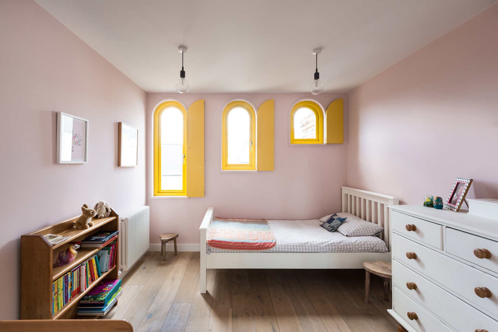
Valetta House, UK, by Office S&M
Among the distinguishing features of the Valetta House loft extension in London are its yellow-framed arch windows, three of which feature in one of the bedrooms.
Office S&M modelled these on the arched sash windows found in neighbouring Victorian residences but gave them a vivid yellow finish to appeal to the client’s children. The colour was based on a light fitting the client had picked for the kitchen.
Find out more about Valetta House ›
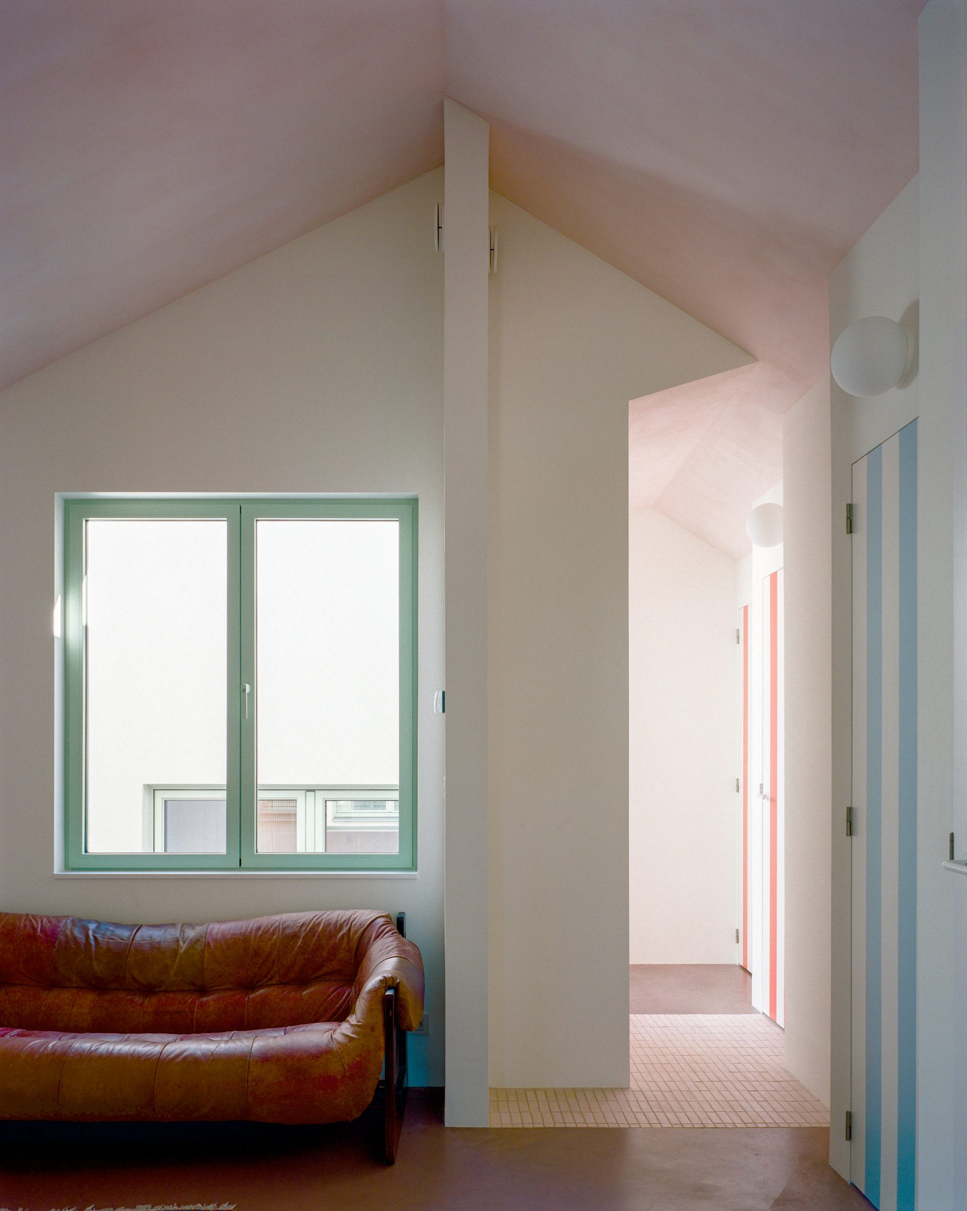
Slender sage-green frames trim the window openings in Dailly, a courtyard house nestled between two buildings in Belgium.
It is among the pastel tones that its architect Mamout has used to bring character to the home, in addition to an array of reclaimed materials sourced from a warehouse that previously occupied the site.

Ugly House, UK, by Lipton Plant Architects
Ugly House is a 1970s house in Berkshire that Lipton Plant Architects expanded with a contrasting two-storey extension.
A bright orange finish was chosen for the windows, including the large garden-facing opening in the kitchen that juxtaposes pastel-blue cabinetry and wooden floorboards.
Find out more about Ugly House ›

House in Ancede, Portugal, by Atelier Local
Large rectangular and circular windows bring light inside House in Ancede, which Atelier Local completed on a sloped site in a nature reserve near Porto.
The openings are outlined with bright red aluminium, brightening the cool-toned interiors that are defined by exposed blockwork and concrete to evoke brutalist architecture.
Find out more about House in Ancede ›

Yellow House, UK, by Nimtim Architects
Another project on the list by Nimtim Architects is Yellow House, named after the spectrum of yellow-green hues that run throughout its interior.
This includes the buttercup-coloured wooden frames of the rear picture window and three skylights in the living room, which stand out against a backdrop of white walls and neutral furnishings.
Find out more about Yellow House ›
This is the latest in our lookbooks series, which provides visual inspiration from Dezeen’s archive. For more inspiration, see previous lookbooks featuring tactile organic modern interiors, eclectic hotels and flooring that enhances the connection between indoors and outdoors.
The post Nine home interiors brightened with colourful window frames appeared first on Dezeen.

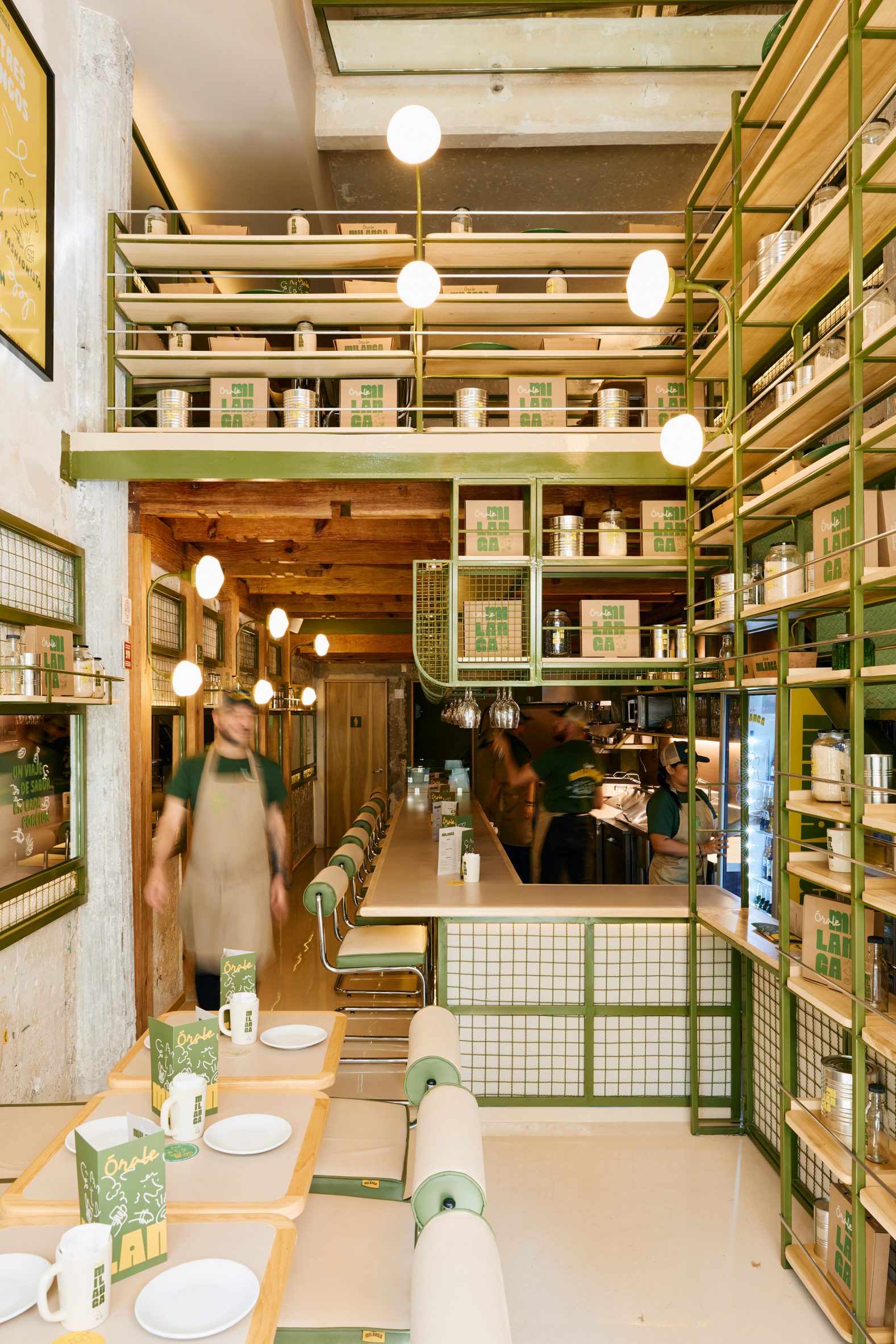
Mexico City studio MYT+GLVDK has designed a fast-casual restaurant where exposed concrete walls are covered in wavy green metal mesh.
The office led by Andrés Mier y Terán and Regina Galvanduque completed both the architectural and graphic identities for Órale Milanga, located in the city’s upscale Polanco neighbourhood.
The restaurant celebrates the “comforting and beloved” dish, the Milanese – which many countries claim to have birthed – in a new concept by Venezuelan chef Jorge Udelman.
“Órale Milanga proposes a fast casual concept that invites you on a journey through Milanese, the main character of a single-item menu that honours different culinary traditions with a variety of ingredients and preparations,” said MYT+GLVDK.

For the interiors, the multidisciplinary studio overlaid the original exposed concrete walls with panels of wavy, olive-green mesh within metal frames in the same hue.
Mirrors also fill a row of the wall-mounted frames, creating the impression of more space for the narrow footprint.
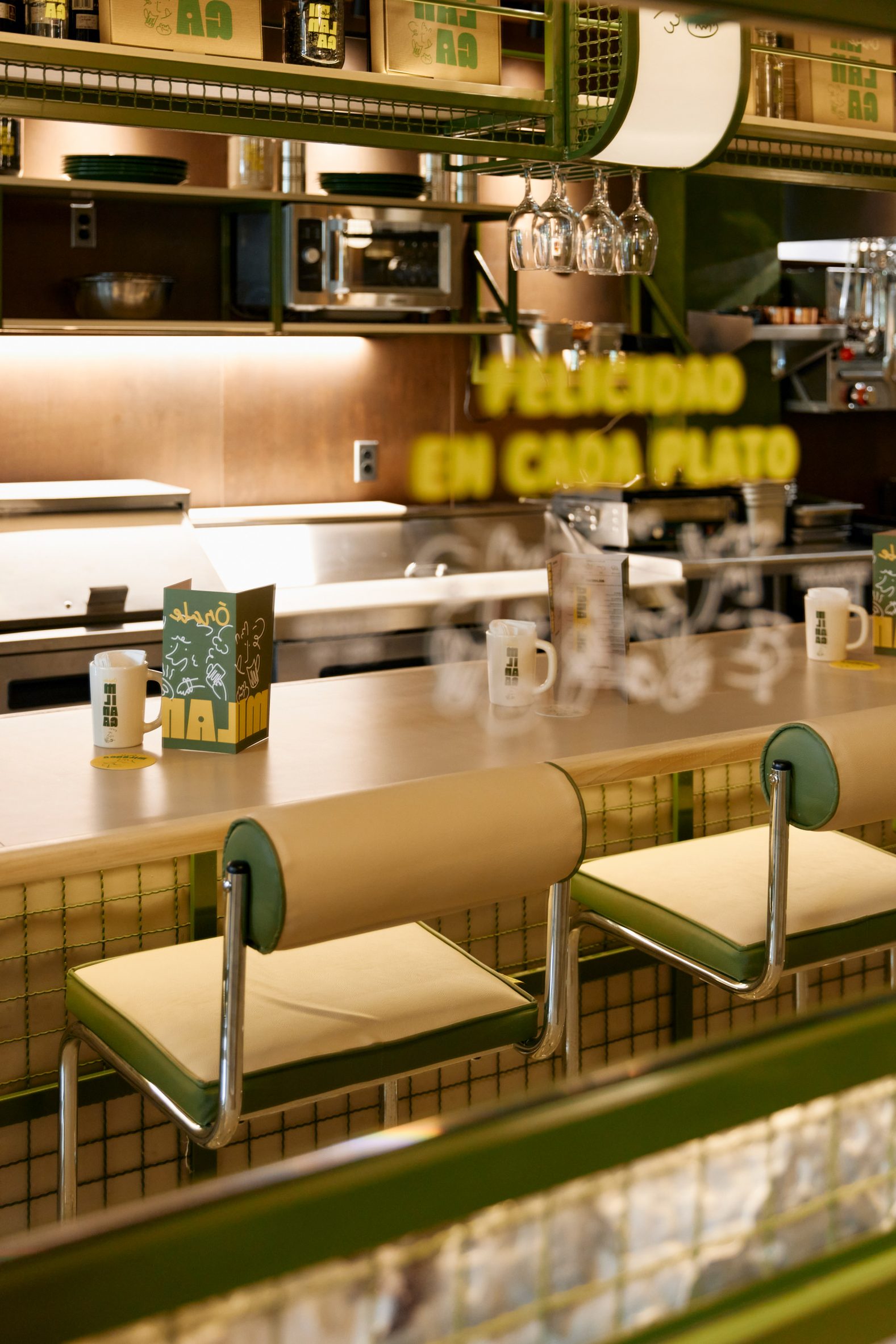
Similar framework forms a tall, open shelving unit on the other side of the restaurant, partially concealing a green staircase that leads up to additional seating on a mezzanine level.
“The presence of the green tones, as well as the wood and ironwork accents, evoke the classic neighbourhood cafes and bars in Milan,” the studio said.

Pale wood shelves display Órale Milanga’s branded products that include take-out boxes, mugs, canned goods and glass water bottles.
Diners are encouraged to eat at either formica-topped tables or a pale wood bar counter, both of which keep the atmosphere in the space light and bright.
Modernist-style tubular steel chairs have seats and cylindrical backs wrapped in beige and olive leather, matching the built-in seating.
Warm LED lighting is emitted from glass diffusers, linked in pairs on curved brass rods that attach to the metal frames.

The restaurant’s laid-back spirit is reflected in its graphic identity, which features yellow and green tones “that communicate the naturalness and joy of the atmosphere… as well as the ingredients used in the kitchen” according to MYT+GLVDK.
Along with bold colours and chunky typography, the branding also features an illustrated group of characters and expressive lines.
“The branding proposal confirms Órale Milanga as a democratic, open and unpretentious space, where enjoying and sharing are the only premises,” the studio said.

Mier y Terán and Galvanduque founded their studio in the Mexican capital in 2015, offering architecture, industrial design and branding concepts and execution.
The team has previously completed a food court inside a Mexico City shopping mall with elements that take cues from Japanese and Mexican design traditions.
The photography is courtesy of MYT+GLVDK and Órale Milanga.
The post MYT+GLVDK creates industrial-style restaurant in Mexico City appeared first on Dezeen.
20 Apr, 2024 | Admin | No Comments
Eight kitchens with striking material palettes of contrasting colours and textures

In this lookbook, we collect eight kitchens that contrast rough and smooth textures, glossy and grainy surfaces, and a variety of colours for an overall eye-catching interior.
The kitchens in this roundup exemplify how a combination of seemingly clashing materials can create a rich and interesting palette.
Some opted for contrasting a number of cool-toned colours with warmer hues, while others made a striking impact by setting colours on opposite sides of the colour wheel side-by-side, like greens with pink or red.
Here are eight kitchens with eye-catching material palettes made up of contrasting colours and textures.
This is the latest in our lookbooks series, which provides visual inspiration from Dezeen’s archive. For more inspiration, see previous lookbooks featuring eclectic hotel interiors, organic modern living rooms and homes where continuous flooring creates a connection between indoors and outdoors.

Brunswick apartment, Australia, by Murray Barker and Esther Stewart
Architect Murray Barker and artist Esther Stewart opted for colours and materials in keeping with mid-century interiors when updating this 1960s apartment in Melbourne‘s Brunswick neighbourhood.
The duo reconfigured the apartment layout, creating an L-shaped kitchen with pistachio green units set against red Rosa Alicante marble on the tabletop, worktops and backsplash.
Find out more about the Brunswick apartment ›
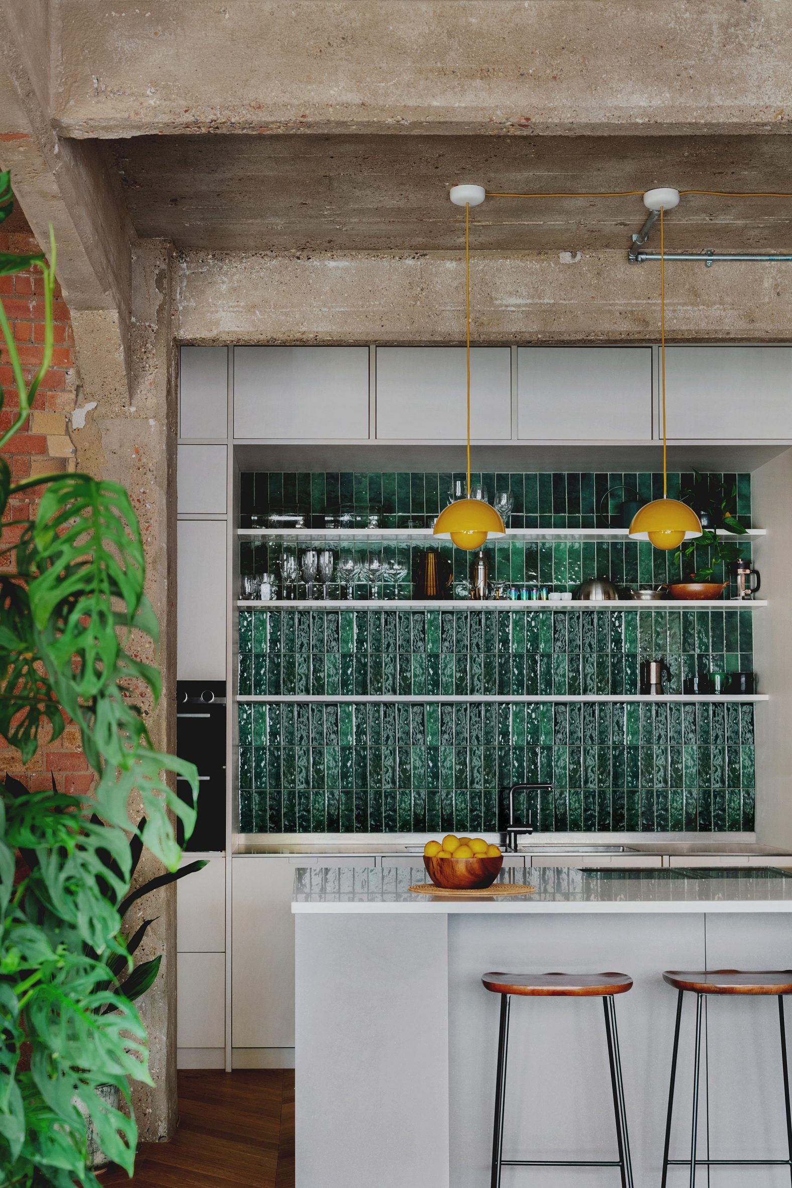
St John Street, UK, by Emil Eve Architects
In its renovation of a London warehouse apartment, local studio Emil Eve Architects aimed to add warmth and colour to the interior without losing its industrial character.
In the kitchen, the glossy and colourful surfaces of the dark green wall tiles and bright yellow pendant lights contrast with the rough textures of the exposed concrete structure and brick walls.
Find out more about the St John Street ›

Lovers Walk, Ireland, by Kingston Lafferty Design
Dublin studio Kingston Lafferty Design also used a red-toned stone in this family home in Cork, Ireland.
The kitchen was overhauled with red tones in various mix-matched materials, including ruby-hued timber cabinets with bright red trims and veiny red quartzite used in the island, splashback and countertops.
This was contrasted with cool tones in the polished floor and steel-blue-painted ceiling.
Find out more about Lovers Walk ›
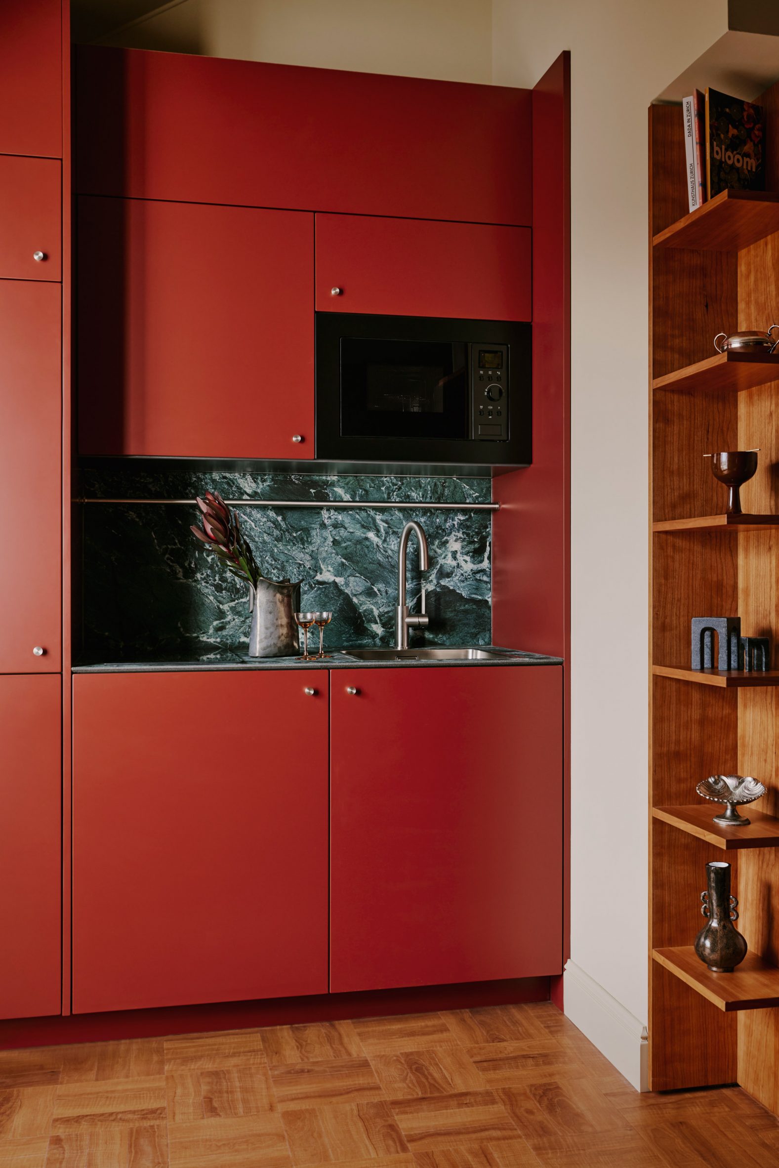
Locke am Platz, Switzerland, by Sella Concept
Smooth, red cabinets are set against a blue-green marble back and worktop in this kitchenette, which is located in a studio apartment in the Locke am Platz hotel in Zurich.
London design studio Sella Concept used vibrant colours and an assortment of different materials throughout the hotel interior, with the aim of “juxtaposing modernism with a classic theatrical flair”.
Find out more about Locke am Platz ›

Paris apartment, France, by Hauvette & Madani
Green and pink tiles create a contrasting wall pattern in the kitchen of this Haussman-era Parisian apartment, which was revamped by local design studio Hauvette & Madani.
Light pink wall cabinets and a bright green stove complement the wall pattern behind them, while a sculptural wooden table adds to the eclectic selection of mixed and matched furniture throughout the home.
Find out more about the Paris apartment ›
Dumbo Loft, USA, by Crystal Sinclair Designs
This loft apartment in Brooklyn’s Dumbo neighbourhood was renovated by interiors studio Crystal Sinclair Designs, which aimed to add European flair to the industrial space.
The studio offset the cool tones of the steely appliances and grey-veined arabascato marble with a wooden farmhouse-style island and deep-red qashqai rug.
Find out more about Dumbo Loft ›
Budge Over Dover, Australia, YSG
Paired-back hues in the terracotta brick flooring and Marmorino plaster walls provide the backdrop to a rich material palette in the Budge Over Dover house in Sydney, which was revamped by interior design studio YSG.
The studio used a combination of raw and polished finishes in the open-plan kitchen and living room, with black-stained timber cabinetry and a kitchen island composed of a Black Panther marble worktop set atop an aged brass base.
Find out more about Budge Over Dover ›

Jewellery Box, UK, by Michael Collins Architects
Jewellery Box is a two-storey extension to a terraced house in London by Michael Collins Architects, which is characterised by vibrant interiors concealed by a subdued exterior.
The kitchen features bright blue units that contrast with shiny gold backsplashes and slender handles on the tall cabinets.
Find out more about Jewellery Box ›
This is the latest in our lookbooks series, which provides visual inspiration from Dezeen’s archive. For more inspiration, see previous lookbooks featuring eclectic hotel interiors, organic modern living rooms and homes where continuous flooring creates a connection between indoors and outdoors.
The post Eight kitchens with striking material palettes of contrasting colours and textures appeared first on Dezeen.
19 Apr, 2024 | Admin | No Comments
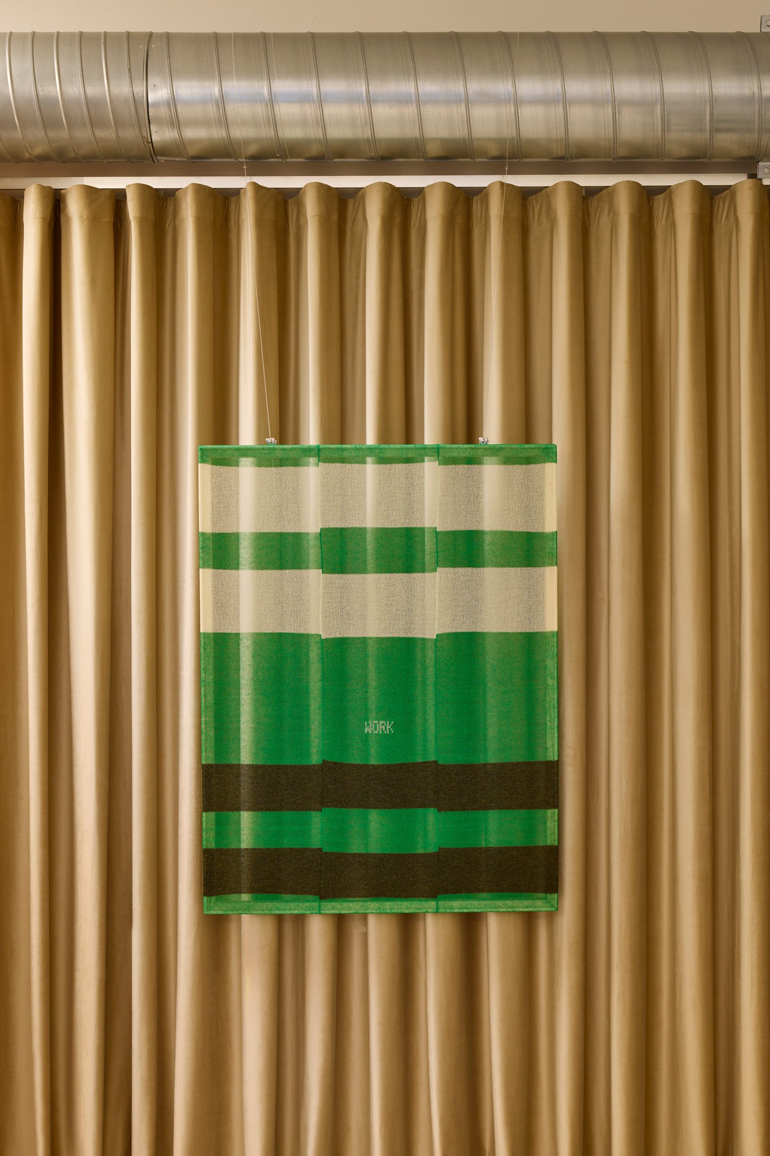
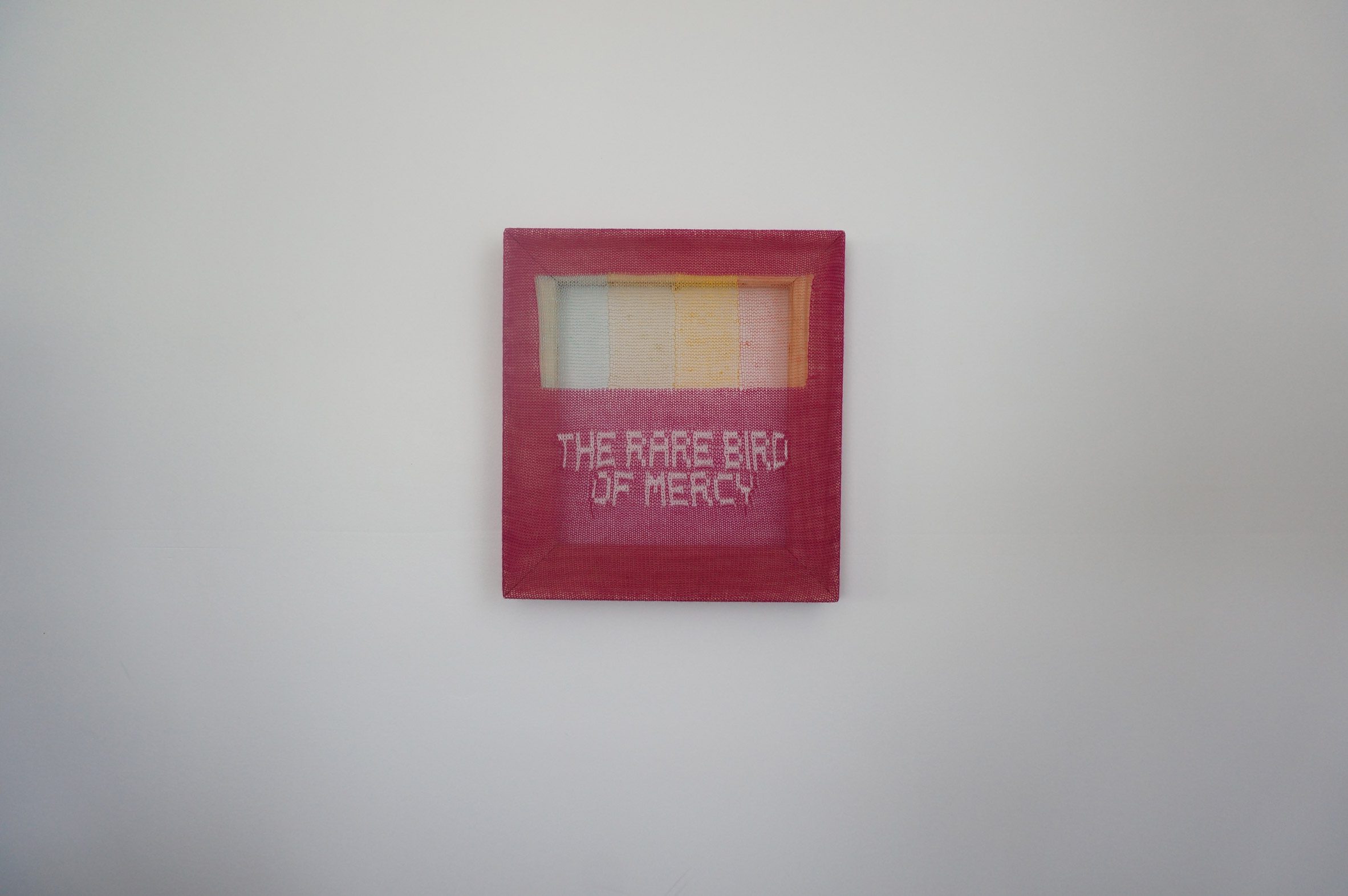
Patrick Carroll presents knitted “paintings” at JW Anderson store

Artist Patrick Carroll has used recycled yarn to create hand-knitted painting-style pieces for the Days textile exhibition at JW Anderson‘s Milan store during Milan design week.
Carroll presented translucent artworks that look “as if they are paintings”, which were made using a 1970s flatbed domestic knitting machine and displayed on wooden stretcher bars – the skeleton of a traditional art canvas – in the store.
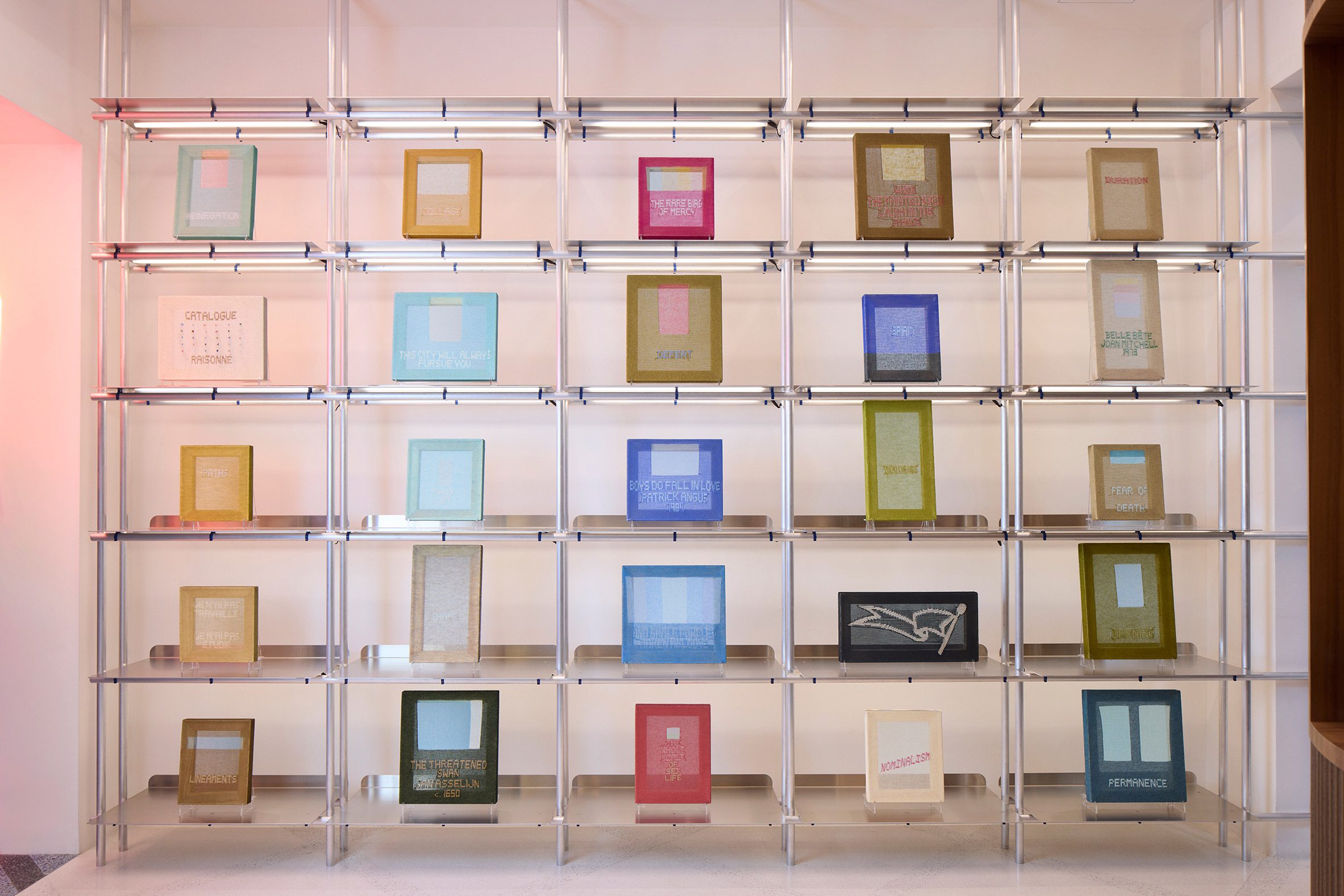
“My stuff is a little bit transparent – you can see the architecture of it all,” Carroll told Dezeen at the JW Anderson flagship store in Milan, where the work is exhibited in a show called Days.
“I was making clothing initially,” he explained, donning one of his own pink creations.
Carroll decided to apply his practice to artworks, designing pieces made from yarn salvaged from remainder shops that liquidate the fashion industry’s leftover textiles rather than sourcing new materials.
Recycled wool, linen, mohair, silk and cashmere all feature in the rectilinear works, which are finished in colours ranging from coral to aqua to ochre.

Like Carroll’s clothing, each piece was characterised by one or a handful of words lifted from sources including literature, existing artworks or the artist’s own writing.
The smallest pieces in the collection were displayed on gridded shelving while larger pieces can be found on various walls throughout the store.
When viewed together, the works were positioned to create a “modular chorus”, explained the artist, who encouraged viewers to form their own relationships with the words weaved into the textiles.
Days follows Carroll’s first collaboration with JW Anderson in 2022 when the artist designed seven knitted outfits for the brand. The clothes were worn by models posing on chunky blue plinths positioned outside the venue of JW Anderson’s Spring Summer 2023 menswear show in Milan.
“I think what makes the works a little bit unique is that they have legs in all these disciplines – fashion, design and art,” added Carroll.
Founded by Loewe creative director Jonathan Anderson, JW Anderson previously created hoodies and tailored shorts moulded from plasticine for its Spring Summer 2024 womenswear show at London Fashion Week.
Various other fashion brands have a presence at this year’s Milan design week. Hermès has created an installation that uses reclaimed bricks, slate, marble and terracotta to draw attention to the brand’s artisan roots while Marimekko has transformed a traditional Milanese bar into a flower-clad day-to-night cafe.
The photography is courtesy of Patrick Carroll and JW Anderson.
Days is on display from 17 to 21 April 2024 at the JW Anderson store, Via Sant’Andrea 16, Milan. See our Milan design week 2024 guide on Dezeen Events Guide for information about the many other exhibitions, installations and talks taking place throughout the week.
The post Patrick Carroll presents knitted "paintings" at JW Anderson store appeared first on Dezeen.